Category Archives: GT30G 2022-23

Instructions and Info for Graphic Tech 30, 2022-23

Designer Portfolio

I want you to have something to show for all of your hard work and creativity this semester, so I’d like you to put together a portfolio of your best work. Mr. C will guide you and show you a great way to do this, but if you prefer to take the information and display it another way (create a website, put together a video, or some other creative use of your talents), that’s fine too. This should be the kind of thing you could take with you to a job interview to dazzle someone with your skills, or prove to your parents that you’ve learned and created a lot this semester.

NOTE: Older course work was supposed to be finished by January 20 anyway, so it is not a priority. That having been said, if there are assignments that can help your mark, I will try to look at them January 30-Feb. 1. You can email me any time in Outlook if you have questions or need help with something, and I will try to catch up with anything that’s already been handed in. Anything else might be looked at before the end of the semester if I have time.

Your job in your portfolio is to display a range of projects that you’ve created and explain the skills that you’ve gained along the way. You should be demonstrating work completed in Illustrator, InDesign, and Photoshop.

Additional Yearbook Pages

Your next task is to fill in the rest of the empty pages in your yearbook document. The pages you design could end up in the actual yearbook this year!

Please read all of these instructions carefully and ASK FOR HELP if something is unclear! You have a lot of flexibility to be as creative as you want, but there are some things that you need to include, so pay attention to the instructions.

Look through those past yearbooks that I provided online (HERE) or grab a few books off of the cart in the classroom for some inspiration and ideas. Your job is not to copy me or any previous books/pages, but you could see how these things have been done in the past. Note/remember that different pages have different backgrounds and designs/themes, so be creative and make your pages look great and unique.

The first page is usually either a title page or an index. You could make either one on your first page.

Sample pages HERE

The yearbook is divided into sections. Each section has a divider page that introduces the content and contains some pictures that would fit in that section. You need to create AT LEAST one divider page.

Sections/Dividers:

  • Academics
  • Arts
  • Athletics
  • Clubs
  • Graduates (or Class of 2023)
  • Portraits
  • Special Events

And then there are pages for special programs, clubs, and events. These pages make up most of the book. Sometimes an event/group/topic takes up half a page, sometimes one page or a spread, or an event with lots of photos might even make up more than two pages or more than one spread.

You can choose your page content by looking at the photos that we’ve collected so far this year.  Photos HERE. At least one of your events/themes should have some text placed in. As you can see in the samples, pages for our sports teams usually have a writeup, and a lot of clubs and events do as well. I don’t yet have the actual writeups for this year to add to your pages, so place in a document from a different event/club that I’ve used in years past. You can find those HERE.

Feel free to add more pages and add more content for a better mark.

Have fun with this. I look forward to seeing your creative designs!

REMEMBER: You absolutely, positively, definitely need to PACKAGE your file to hand it in. You’ll have a lot of files linked and without those, your pages will not look good.


Adding Portraits and Names

Make sure you’ve carefully followed the first two sets of instructions and have your pages set up correctly!

You will need a list of names FROM HERE. You can choose whichever list you like. Download that list and put it in your Yearbook folder.

You’ll also need pictures. We’ll use the icons you can get HERE. Again, download that list and put it in your Yearbook folder.

You’ll need to put that list of names into the text boxes. You could copy and paste each one into a separate box OR you can get InDesign to fill the boxes for you!

Right now each box is separate, but you can link them together so text can flow from box to box. On the right edge of any text frame, there’s a white square in the middle.

If you press that, you can create a link (notice the chain) and click on another box to link them together.

Keep linking the boxes all the way across. When you get to the last one in the row, link it to the next row below.

Keep going until you get to the very last one.

Go back and select the very first box. Go to File/Place, or Ctrl + D and find the list of names that you should have in your Yearbook folder

Once you select that text file, you will see text attached to your cursor.  Go click on the first text box:

If you’ve linked all of your boxes correctly, you should see a mess of text in all of the boxes:

Highlight a name and go to your Properties panel. Change the font FOR SURE, plus make any other changes you want to colour, size, spacing, alignment, etc.

Note that due to the limited space in those boxes and the long names that some students have, you will almost certainly need text on two lines. I hit enter between the first person’s first and last names

Here’s one of those cool InDesign tricks that will save you a lot of time later.

Open the Paragraph Styles panel (Window/Styles/Paragraph Styles)

I use that one all of the time, so I added it to my icons on the right hand side. Drag that panel into that strip and you can open it from there any time.

If you double click the name of that paragraph style, you can rename it and make changes to it. I’ll name mine portrait names:

and if you wanted to, you could make any change to the style and all of the text that has that style applied will be changed.

If you select all of your text (put your cursor into any text box and press Ctrl + A) then press that new style, all of the text will have the exact same formatting. This comes in handy if you’re doing other pages of the yearbook and want the text to look the same.

As mentioned earlier, all names should be on two lines. Unfortunately, you have to go name by name and hit enter (there’s probably an easier way, but I don’t know what it is. Let me know if you can find out!)

As I’m going through, I notice a big problem with some names that are really long


Lucia’s name does not fit properly even on two lines. If hers is like that, there are bound to be others. I’ll try adjusting the style and making it a bit smaller

That still isn’t enough in Lucia’s case. Sometimes, you have to adjust just one name. If you highlight text and don’t adjust the Paragraph Style, you can add other characteristics to just that highlighted text. Obviously, I could try a smaller font for her name, but that can stand out if the size of one name is obviously smaller than the others.

In order to avoid that, I’ll highlight Lucia’s name and go into my Properties panel:

At the bottom right of the Character section, there are three dots that will open up more options:

There are some other things you can try if you need to make text fit in a smaller space.

One is Tracking, which will pull the letters closer together and get rid of some of the space between. This can make text harder to read.

Another is Horizontal Scale, which makes the letters themselves narrower. Again, getting too carried away will distort the text and make it harder to read.

Lucia’s name now fits better

If you look in the Paragraph Styles panel, you’ll notice a plus sign, which indicates that the style has been modified for this text

This looks MUCH better, but there’s a problem. I can only get to names that start with F on this page, so I’m going to need more:

Zoom out (Ctrl + 0)

Draw a box to select everything on the page:

And do that Alt + Shift drag trick to create a copy on the opposite page:

But that page now has the same names as the first one. Put your cursor inside of any of those boxes and then press Ctrl + A to select all of the text:

Hit Backspace or Delete and voila:

Now, just link the bottom right frame on the first page to the first frame on the new page:

Then you have to go through and put the names all on two lines, and that’s it! You will not have enough room on two pages to fit all of the students in any grade. You can create a third page to finish it off if you like, but you don’t really need to.

Next, we put the pictures in. (don’t worry, that’s much easier!)

First, make sure you SAVE your work if you haven’t done so lately!

I don’t have all of the actual portraits yet and sometimes matching them up is a bit of a pain, so we’ll just fill the photo frames with pictures from that icons folder I had you download.

Select the first frame:


Go to File/Place or Ctrl + D and find that folder. Select the first one:

These photos aren’t really going to fit properly, so if you run across any that look really goofy, you should click on that centre donut and move the image up or down in the frame so it looks better:

Keep placing those in the frames until you fill the page.

Once you have the frames filled, you can SAVE your work and the hardest pages are done!

If for some reason you don’t have everything in one Yearbook folder (ahem, why not?), you will need to Package your file from time to time to make sure you don’t lose any pieces.

Yearbook Portrait Pages

Perhaps the most challenging pages to create for the yearbook are the portrait pages. If you can get these pages right, the rest of the pages I’ll ask for should be no problem!

I’ve given you some past yearbooks to look at for inspiration and guidance. You can check those out HERE

When you open your document, just make sure that the Color Settings are still set to Jostens 2022.

If they’re not (like mine), click Load and find that .csf file you should have moved into your Yearbook folder

When adding elements to your pages, remember what the guides are for!

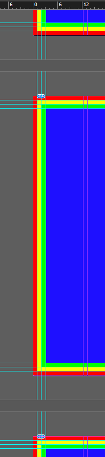
The outer guide (red area) is the BLEED. This part will be cut off. You extend page backgrounds or perhaps some images or shapes to the edge of the red, but it will be cut off. NOTHING should END right between the yellow and red areas. If you want something to go to the edge of the page, extend it into the red.

The yellow area is the danger zone. Never put anything super important in that area. The page should be cut right on the line between the yellow and the red, but it isn’t always precise, so you may lose parts of the yellow. Extend backgrounds, shapes, perhaps some pictures into the yellow, but never put text or people’s faces there.

The green area is just a margin. You CAN put anything in there, but it’s wise to give yourself a bit of a margin, so you may not want to use that area (although if you need the space, go right ahead.)

The blue area is totally safe. Fill that up however you want!

Between the pages there’s a “GUTTER.” This is the area where the book folds. You probably won’t be able to see or read anything in that area. Backgrounds and shapes should go into that area for sure. Some pictures can go in there, but try to keep faces out of there. Text should NEVER go in that area.

NOTE: I am showing you MY DESIGN. YOUR DESIGN should be different! I do not want a bunch of pages that look exactly like mine! You get marks for creativity, and copying me is NOT CREATIVE!

The first thing you may wish to consider is the BACKGROUND. That place holder image that I put on my Parent page is not designed to be used on more than one spread. You need to choose your own backgrounds. Those can be fairly plain (colours and shapes), artistic (things drawn/created in Illustrator or Photoshop), or a photo that is fairly plain and doesn’t need to be paid attention to. Look at those sample yearbooks for some ideas.

On my PARENT pages, I have 3 layers. The page numbers are on the TOP layer. I would LOCK THAT LAYER and never put anything else on it!

My background image is on the bottom layer. Keep the frame with the background image UNLOCKED

When I switch to my individual pages, I will put all of my content on Layer 2

Switch out of the Parent page and onto one of your spreads (two pages beside each other)

To edit the background and replace it, activate the Selection tool (press v or click it in the tool bar) then hold SHIFT and Ctrl and click on the background. Now you can place something new in there. There are some photos that my photography students took that you may want to consider. You can find those HERE. Of course, not every page should have a picture in the background, so you could use colours, shapes, or artistic elements instead. You may also want Westwood logos somewhere on your pages. You can find those HERE.

If you want to use Westwood logo colours in your design, you can put the following values in when choosing a colour:

Maroon : 9f1c36

Grey : 939598

Once you’ve placed your background into that frame on Layer 1, I highly recommend locking it!

At the top of the page (or both pages), you should have a title that indicates which pages you are designing. You can choose to do grade 9, 10, 11, 12, or the staff portrait pages.

Notice how the shape extends all the way to the outer edge of the red (and beyond.) You can make that as far past that line as you want. I like to make mine extra big. You can press W to see what it’ll look like:

Keep in mind that part of it will get cut off, but without the guides and lines, it looks pretty nice:

Again, all of my added elements will go between the background and the page numbers! You can have as many layers as you like in between, but I’ll keep everything on Layer 2

To make life even easier, you can rename your layers if you like in order to remind you what they are for. Double click on a layer name and you can rename it!

For the next step, activate the Frame tool (press F). You can click and hold on the tool in the toolbar if you want frames that are circular/elliptical or polygonal for a more creative and unique design

I’ll drag out a rectangular frame. I’ll have to guess the size.

Make sure you can see your Properties panel. If not, all panels can be found in the Window menu. With that frame still selected, I’ll change a couple of options in order to make life a lot easier.

I’ll open those Frame Fitting Options. I HIGHLY recommend turning on Auto-Fit, setting the Fitting to Fill Frame Proportionally, and making sure that they Align From the centre.

You may wish to add a stroke to your frames. That way the pictures don’t just kind of blend together. I personally like to use Westwood logo colours fairly often, so if you wish to use them anywhere, you can put in those colour values I listed near the top of the page (Maroon : 9f1c36 or Grey : 939598).

Each picture needs a name. I usually do those below each picture, but some layouts have the names in a list on the side. You can choose, but mine will be below.

Switch to the Type tool (press T) and draw out a smaller box that’s the same width as the picture frame.

I’ll fill mine with school logo grey. Since the picture frame has a 1pt stroke, if I want my text box to be exactly the same size, I’ll add a 1pt stroke to the text box as well.

FYI, I have my frames lined up with that inner guide right now, but if I need more space, I’ll move them left to the next guide:

When I use text frames, I like the text to sit in the middle of the box, not the top. Select the box with the Selection tool and press Ctrl + B. I recommend changing the Vertical Justification to Centre.

. I

Still with the Selection tool, I’m going to select the picture frame and the text frame by dragging a box over both of them

I need a lot more of these but I don’t want to go through all of the steps to make them look the same, so I’ll copy those. Press and hold ALT to drag out a copy. To make sure that they line up, press Shift as well. So I’ll hold Shift + Alt, click on those frames and drag a copy to the right.

You can leave a bit of space in between if you like or line them up side by side.

You could keep doing that one at a time OR once you’ve got two, select both and drag those out to make it four.

Once I’ve got four, I like to select again and drag out another 4. 8 across is probably a good number but you can add more if you like, depending on the layout you’ve chosen.

I’ve still got a bunch of space on the right side of this page and I don’t want to add more boxes to the row:

So I’ll select them all and pull the little white square on the right hand side to stretch them to fill up to the middle gutter guide:

Much better. Now I’ll Alt + Shift and drag a copy down.

I’ll keep doing that until I have about 6 rows:

There’s a bit of space at the bottom now, so I’ll select all of those and drag the square in the middle of the bottom edge down

Much better!

Make sure you SAVE your work! You really don’t want to lose all of that!

In the next set of instructions, we’ll Place in the content.


Yearbook Page Setup

Before you start, do yourself a big favour and create a YEARBOOK folder in ONEDRIVE. Put ALL of your elements in there! Every time you download or create anything for this project, put it in that folder! (and, of course, make sure that OneDrive is running on your computer!)

Putting everything into a folder now will save you a lot of headaches, trust me!

Go to the following link and download the files into your yearbook folder: Page Templates

Create a file in Indesign that is 52 x 68 picas, 10 pages (facing), with NO BLEED or MARGIN. I usually set up 3 or 4 columns for myself, but that’s a personal choice and I don’t even end up using them all that often.

Save your file into that Yearbook folder.

There is a specific colour profile that we have to use for the yearbook. You need to download THIS FILE from HERE. Save that into your Yearbook folder as well!

To load that file, open the Edit menu and click Color Settings…

In the box that pops up, click the Load… button on the right

Navigate to your Yearbook folder where that Jostens 2022 file is stored

Once you’ve selected it and it’s loaded, click OK

The goofy part of that is that you have to do this every time you work on this file on a different computer, or if you go to create something in Photoshop.


When using InDesign, I prefer to use the Essential Classics workspace, so that’s what my screen will look like, but choose whichever workspace is best for you.

Your Pages panel right now should look like this:

I recommend going into your Layers panel:

and adding at least two more layers right away:

You’ll need to do some setup on the Parent pages in order to save yourself a lot of work:


Use the Frame tool (press F on your keyboard) and draw a frame that goes to the edges of your pages

PUT THE FRAME ON THE BOTTOM LAYER

You will Place in the page template that you downloaded above. (or now… PAGE TEMPLATES HERE)

You should see this:

Make sure your Rulers are showing (Ctrl + R)

Zoom way in to the top left corner:

In the grey area BESIDE the page (not actually on the page), drag out a guide by clicking on the ruler and pulling down. Drag a guide to the edge of the blue, green, and yellow rectangles:

if you’ve done it correctly (beside the page not on), your guide will go right across and off the right side of the page as well:

Repeat the process at the bottom of the page:

You also want to create vertical guides along the sides. Drag from the left arrow to the right and snap to the edges of the blue, green, and yellow rectangles.

There is a yellow area in the middle where the book folds. You should put guides along those yellow lines as well:

and do the right edge:

If you zoom out ( Ctrl + 0 or Ctrl + – ) your page should look like this:

If you’ve done this correctly on the Parent pages, all of your pages should look the same:


The RED area is your bleed. Page backgrounds should extend to the outer edge of the red, but that area will be cut off, so never put anything important in there!

The YELLOW area is a margin. You shouldn’t ever put anything important in that area because it may get cut off.

The GREEN area is fine to use, but it acts as a safe margin. I wouldn’t put anything too important in there because it’s too close to the edge of the page.

The BLUE area is where your content will go. Anything important can go in that blue area, right up to the edge.

Make sure you’re still on the PARENT pages!

For the next step, I’m going to stay on the bottom layer (Layer 1). Use the Frame tool (letter F) to create a frame that goes all the way to the edge of the page. This will be my actual page background for each page. Place any picture in there to act as a placeholder. I used a picture of the school, because if I ever forget to replace it, at least I’ve got something appropriate. You can get school photos HERE if you want to do that too.

The photo that I used doesn’t fill the frame:

So I’ll have to go into Frame Fitting and “Fill frame proportionally” (the first one.) I always like to turn on Auto-Fit as well:

That looks much better:

Now I have a frame ready to go that I can change on individual pages.

One more important thing to set up on the Parent pages is the page numbers. You absolutely need to make sure that you are working on the Parent pages for this:

IMPORTANT TIP: work on the TOP layer for this step (mine is Layer 3)

At the bottom of one of your pages, draw a text frame where the page number will go.

With your cursor in that box, go into the Type menu, then Insert Special Character, Markers, Current Page Number ( Ctrl + Alt + Shift + N )

That will put a letter A into the text box. Highlight it and change the text Properties. Always change the default font!

If you want, you can center the text or leave it on the left like me, then go into Text Frame Options ( Ctrl + B ) and change the Vertical Justification to either Center, or Bottom, since this will be at the bottom of the page:

Mine now looks like this:

Now I would zoom way out so you can see both pages. Click on this text frame, hold down Alt and Shift, and drag a copy of that box all the way to the right, so it sits in the bottom right of the other page

I am going to change the justification of that text so it lines up on the right now:

Lastly, I recommend taking that top layer and locking it. Do not put any page elements on a layer above this. This layer should always be at the top.

Now if you switch to any other page, you’ll see its number in those spots! If you put all of your designs on the layers below, those page numbers will always show on every page.

If you haven’t done so already, SAVE your work!


Major Project 1: “Customer” Portfolio

Congratulations! A small business owner has chosen you as the graphic designer who will be responsible for building the company’s brand. You will be responsible for coming up with a new look and a range of products that will suit that business and grow that business.

This year, if you’re in grade 12, you have a bit of a choice, but in future years, there will be a difference between grade 11 and grade 12.

Grade 11: You come up with a “business” yourself. It can be a real business that you are creating products for, or a made up one. My suggestion is to create a business that is YOU. What are you looking to do with your life? If you want to be a mechanic or a baker or a teacher (please reconsider) or a graphic designer, create a logo and a range of products that would promote your business! If there’s a business you’d like to work for eventually, consider impressing the owner/manager by walking in with a whole new design for their business and show off the skills that you have to offer!

Grade 12 option (not as optional next year): Actually connect with a real business and offer to work for them (yes, for free.) Work with an actual customer to develop something that a real business might be interested in using to build and promote its brand. Local, small businesses will definitely be easiest to work with/for. If you already have a job and want to work with/for your boss, great. If not, consider some of the suggestions below or consider a place where you’d like to work or at least in an industry where you’d ideally like to work and get in touch with the owner/manager! How could someone not want to hire you after you’ve already proven that you can be creative and dedicated?

Folks I know and can get you in touch with:

  • Robson Maintenance (sign & billboard installers)
  • Shorten Automotive (mechanics)
  • Original Pancake House
  • 1882 Fruit-Based Hot Sauce
  • Argy’s Records
  • Trout Forest Music Festival
  • Static Roots Festival
  • ToneToaster Records
  • Times Change(d) High & Lonesome Club (music venue)
  • Hamm-Tone Guitars & Mandolins
  • T & A Garage (house concerts)
  • The StuDome (house concerts)
  • Applied Technologies (software developers)
  • Elevation Woodworks & Signs
  • UMFM 101.5 fm
  • CKUW 95.9 fm
  • I also know or can at least get you in touch with a lot of local & independent musicians who would really appreciate your help!

Or, reach out to local businesses & teams! Make a new logo and promotional goods for one of our Westwood teams or a community team. Make something up for your church or community club. Get in touch with the Westwood Pharmacy, Sushi Terrace, D-Jay’s, King’s Restaurant, Activate, The Real Escape, Pawsh Dog, Burrito Splendido, Earl’s Automotive, Food Fare, a nearby dentist, chiropractor, or just about any small business!

Here’s a really good (but really quick) look at the process of designing or redesigning a brand:

This one is also very informative:

Whether you are working with a real customer or not, you’ll have to explain the business that you’re designing for and who their customers are.

You’ll have to figure out and explain what the customer wants. What are they hoping your designs will do? Will it attract new customers? A whole new audience? Will it change the way their existing brand is perceived, or just build off of an existing design/strategy?

You’ll have to figure out where your designs will be used. What kinds of products are they going to want? Keep in mind the kinds of things that we can make here: business cards, greeting cards, calendars, menus, magazines, advertisements, brochures, booklets, signs, stickers, buttons, shirts, hats, tote bags, toques, water bottles, mugs, ceramic tiles, mouse pads, and more!

Who are the main customers of the business? Are they young, old, male, female, rich, poor, etc.? Knowing that will help guide your design decisions.

What colours & fonts do you want to use to appeal to those customers? Does the owner/manager have colours or types of fonts that they want you to avoid or incorporate?

Once you know all of that, you want to come up with some design concepts!

Do a rough version of a few different ideas and present them to your customer (or me/the class) and get some feedback!

Revise! Then get feedback and revise again if necessary.

Then the fun stuff starts! You start making all of the products that will help the business!


This is a MAJOR PROJECT, so it’ll be worth A LOT more than the projects you’ve done so far! You’ll want to take your time and do the best job possible every step of the way. You’ll want to communicate, ask questions, and get feedback every step of the way!

The idea here is to show what you’ve learned throughout the semester. You’ll likely want to incorporate the three major programs we’ve used (InDesign, Illustrator, and Photoshop) because each one has a different role in production and design. If you’re only using one, you’re not showing a range of abilities.

You’ll need to produce, or at least prepare for production, some actual products. So you’ll actually print and cut out some business cards, perhaps, You don’t necessarily need to make shirts, hats, bags, mugs, etc., but follow the steps involved and make it so they could actually be made if we wanted to.

Your reflection will consist of the initial research/thinking you did before you started, some of the revision ideas and changes you incorporated, and some feedback in the end telling you how you did. You’ll tell me about what you learned, what you enjoyed about this, and the troubles you had along the way.

Package Design/Redesign

For this project, you’ll come up with a new product or take an existing product and design all-new packaging for it. You can use Photoshop, Illustrator, or InDesign for this one.

Watch this video for a really insightful look at designing a new package for an existing product:

In that example, the designer took a look at the packaging for an existing product and decided that it needed a serious redesign in order to appeal to kids. She took the time to consider what types of colours, images, and lettering styles might appeal to a kid, and incorporated those into a new package. Your job is to do the same thing.

If there’s an existing product or brand that you like and know well, you could design an all-new package for that product or brand. You could also come up with a new product yourself and show me what the package might look like.

TAKE YOUR TIME. Think about all of the elements you incorporate into your design, and consider how they will increase the appeal for the target audience. You will hand in a reflection explaining your thought process behind the elements and design choices you make. Why did you choose those colours, those images, and that font/type style? How do those choices help make a product that would appeal to a specific audience?

Fun Final Photoshop Project

If you’ve finished the projects that we’ve done in class and have finished three of your own, you should be well on your way to becoming a Photoshop master. Now it’s time to put your impressive skills to the test by creating something AMAZING!

Read through ALL of the instructions before you begin!

You will need to find images for this assignment. For ones found online, make sure that they are BIG, HIGH QUALITY images! If you’re tempted to use good ol’ Google Images, make sure that you use the available search tools to limit your search to LARGE images! CHOOSE WISELY! Quality really counts! Use CREATIVE COMMONS pictures like the ones found on Unsplash, wherever possible!

You may also need to TAKE PHOTOS yourself as well. Use a good camera (ie use one of mine or something similar.) Make sure that your photos turn out well and that you’ve made life easy for yourself (ie if you can help it, take your photo against a plain background, make sure that there’s enough light. We do have a photo studio in the other room, you know!

Any photos placed into your project must include an ORIGINAL copy of the image that you HAVE NOT touched. These will be layers that are hidden, but there for me to compare the ORIGINAL image to the one(s) that you have manipulated.

Any objects that are cut out of the original should be cut out cleanly. Use the correct selection tools/methods, NOT THE ERASER!

All layers should be properly named.

Your file should be saved with the correct name. eg: photoshopproject.psd

You will have to remove/cover/modify parts of an image (or images). Use the correct tools.

Use text! Make that text fit in with the original image (try to match the font, size, colour, or choose something that fits in with what’s already there.)

Use drawing tools/shapes/brushes to add new elements in.

Use layer styles to add appeal/interest to your layers.

The assignment:

Create or modify a movie poster, album cover, or book cover. If you have a different idea, please run it by me first, but I am certainly open to new suggestions.

Find a movie poster/album or book cover online. Add new elements to it using the criteria above OR recreate one with new pieces. Change/modify the look of what’s already there (take out, replace, and/or add new stars to the movie, songs to the CD, information about the book, etc.)

This is NOT as simple as putting your face on top of someone else’s in a movie poster (although that could be part of what you do.) You need to be creative and you need to use the tools listed above.

Doing this well will require some PLANNING/thinking ahead. Before you commit to an idea, take some time to think about what you’re going to remove, add, or modify. If you’re not sure whether something will work or whether it’s a good idea, TALK TO ME.

The finished project should look realistic. If it’s easy to tell what you’ve added/changed/replaced, you probably didn’t do a good job.

MOST IMPORTANT:

TAKE YOUR TIME

DO A GOOD JOB (don’t just worry about just getting it done, actually create something you will be proud of)

Don’t be afraid to MAKE MISTAKES and FIX THEM. This means that you could have to go back a bit and undo some mistakes, or in extreme cases, start again!

If you need help with a particular tool or idea, consider looking up a video tutorial on Youtube or search for one and find a website that will show you how to do something. There are thousands of great Photoshop tutorials out there.

HAVE FUN! If this isn’t fun, you aren’t doing it right!

Examples

before:

after:

before:

after:

Some of my QUICK (not necessarily GOOD) Photoshop projects: (yours will be BETTER THAN THESE! These do not necessarily meet all of the criteria for this assignment!):

the-wizard-of-oz swiper SuperDiaperBaby robsonj_book2 Robson_Peanut_Butter_Cups1 robosonj_Bad mr-t Billion

The New You

Have you ever wished that you could live someone else’s life for a while? Well, with the magic of Photoshop, you can!

For this assignment, you’ll blend your face (or mine, or a willing classmate’s) onto a new body, or take someone else’s face and put it on your body. You’ll take your new subject (new face on head/body) and put this person on a new background.

Technically, you don’t need to use a photo of you, me, or someone in the class, but it REALLY HELPS to be able to pose/look in a very specific direction and make sure that you’re using somewhat similar lighting.

MAKE SURE YOU ARE USING HIGH-QUALITY IMAGES! Your end result will not be good if you start with one or more low-quality images! Use a school camera to take your photos if you can.

CHOOSING THE RIGHT IMAGES IS THE MOST IMPORTANT PART! Take your time! Make sure that the images would wok and make some kind of sense together. Ideally, the new face will come from a head that is looking in the same direction as the target head. Ideally the light will come from a similar direction.

High-quality photos can easily be found on Unsplash: https://unsplash.com/ Click the arrow on top of the thumbnail in your search results to download

If you ABSOLUTELY MUST use another site, MAKE SURE you’re using Google (NOT BING) and click Tools

and change the Size to Large

If you wish to use a picture of yourself or a classmate, borrow a camera from me and take the photo that way. If you want to try to use my picture (or a photo of my kid), there are some HERE

How to start

I would find ALL THREE of the required photos (face, body/head, background) FIRST.

I’d like to print some of these out, so start with a file that is 8.5 x 11 (or 11 x 8.5 if you want it Landscape) with a resolution of 300 pixels per inch

SAVE YOUR WORK in OneDrive right away!

Add each of your photos by going to File and Place Embedded

I want to see a layer for ALL OF THE UNTOUCHED PHOTOS!

Rename your layers and make a copy. Lock and turn off the original. Work on the copy

Background & Subject

Resize your background PROPORTIONALLY so you don’t squish/stretch it

On your body/head layer,

click the Select menu and choose Subject

Make sure the seletion looks good (no parts missing, no extra parts of the background included)

The easiest way to separate the body from the background is Ctrl + J (copy to new layer). Name it.

Now I have my new body on top of the background:

How to swap faces

There are a lot of great tutorials on YouTube that will show you how to use Photoshop to do a face swap.

Here’s a good one:

Here’s another:

You don’t really have to do a reflection for this one. I’ll get you to use these skills in another project later on, and you’ll do a reflection for that one.

InDesign Monthly Calendar

For this project, you’ll create your own monthly calendar, even better than the ones you’ll soon start seeing at the mall!

Here are my tutorials that will show you how to do this my way:

*Important note: I messed up when I set up my calendar in my videos. You actually need 28 pages for it to print out right. You can add December, 2022 or January, 2024, or just a couple of pages of extra photos or a letter to the person you’re giving it to, or whatever you wish!

*Other Important note: If you want your calendar printed (and you should because they look awesome and make great gifts!), you should add a small “Bleed”, which is an extra little bit of your images/background that will be cut off eventually. When you add images and backgrounds, extend the image off the page a bit. Make sure nothing important is in that area because it will get cut off!

Also, if you want it printed, you need to rearrange your pages in a really odd way… Scroll down to the bottom of this post to see how it is laid out for print.

If you don’t like my way, I really like this tutorial:

I also really like THIS WEBSITE

If you need a 2023 calendar to line up your dates right, CLICK HERE

First, decide on a theme for your calendar. If you want to use someone else’s photos, I HIGHLY recommend using unsplash.Remember to click the arrow on top of any photo you want to use in the search page.

I also HIGHLY recommend putting your photos in a folder in OneDrive! Oh, and MAKE SURE ONEDRIVE IS RUNNING!

You’ll need AT LEAST 12 photos (one for every month) but you might want different photos on the front and back cover, and you can have more than one photo per month if you wish.


LAYOUT OPTIONS FOR PRINT

You added two extra pages. You need to decide whether your extra pages go at the front or the back. My recommendation would be to add December of this year to the front, or some kind of letter to the person you’re giving the calendar to or something like that. Some people prefer to put extra photos at the back or add January of the following year.

Extra pages at the front:

Extra pages at the back: