Category Archives: 605Computers

Assignment 2: Microsoft Word Trading Card

Next up, you are going to create your own trading card. It can be for yourself, your favourite hockey player, athlete, Pokemon, super hero, Teletubby, technology teacher, or anything, really!

Be CREATIVE and HAVE FUN!

You will use a lot of the skills that you learned in creating your timetable, so I WILL NOT show you this one step-by-step! There are a couple of new things that I will show you, but otherwise, you’re on your own.

Here’s my fabulous example:

Note that at the bottom, there’s a TABLE with some statistics. The left column is aligned on the left, the middle one is in the centre, and the right one is on the right. The borders are invisible.

With the borders, it looks like this:

You will have to use most of the skills you learned in the previous assignment:

  • Save your file in the correct spot as Trading Card.docx
  • I did not change my layout but I did change my margins to narrow
  • The blue & black background is a Shape:

I used a rectangle with rounded corners, but choose whatever works best for you. Consider using more than one shape if you like!

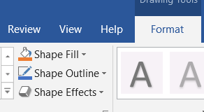
You can change the colour of your shape with “Shape Fill” and the border around it with “Shape Outline”

Then ALL of my writing is in Text Boxes (much easier to move around!)

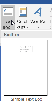
Under Insert, choose Text Box, and Simple Text Box

Draw it wherever you want on your page. I used THREE of them (one for the title, one for the biography, and one for the statistics table.)

Text boxes can/should also have a Fill and an Outline!

Then back to skills that you already know:

  • Change fonts, sizes, and colours
  • Properly centre text (and in your table, put the right column on the right)
  • Add a picture (those can/should have a border too!)
  • Table at the bottom with statistics. Make it at least 3 columns and 2 rows. Your statistics could include things like height, weight, superpower, teams played for, awards won, favourite food, or whatever you want, really. Make a heading row (and make those headings bold, underlined, or a different colour so that they stand out!)

Timetable Step 3: Colour & Pictures!

By now you should have:

Step 1:

  • created your file
  • named it Timetable
  • saved it in either your OneDrive or Documents folder
  • changed the layout of your paper so it is Landscape
  • changed the margins so that they are Narrow
  • inserted your table (11 x 9)
  • merged your title row
  • added the times and school days
  • filled in the periods

Step 2:

  • Your font and size should be changed (NO Calibri 11)
  • Your text should be centred (WITHOUT using the space bar) horizontally and/or vertically
  • Everything should fit nicely into your cells (resize as necessary)

Step 3: Let’s make it pretty!

To fill in your cells, you need to click inside an individual cell, or select multiple cells or the entire table. Below, I have my second row (the periods and breaks) selected:

There are two main places to look to colour those in.

1) On the Home tab:

You can find a paint bucket that will fill in the selected cell(s)

OR

Under the Table Tools section, choose Design and find the paint bucket there (labelled Shading)

Choose any colour you like:

I like mine colour coded so that each class is a different colour/shade, but you can have fun with it and personalize it as you wish.


Some of you have noticed that I have a box near the top that is not shaded in with a solid colour:

To do that, select a cell (or row, column, or your whole table)

Then look under Table Tools and Design.

Under the button called Border Painter, there’s a little box that you can click for some neat shading options:

This has 3 main sections. Choose Shading and look at the many options available:

Changing Borders

Again you can choose to do one cell at a time or multiple. I’ll change all of my borders at once by selecting the entire table.

If you look under Table Tools and Design, you can find some Border Style tools.

If you choose Border Styles, you can find a number of preset borders.

Better though, is to make some choices yourself. You can choose a style of line:

A thickness:

A colour:

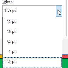
And a line width/thickness:

You can even remove some or all of your borders under “Borders”

A great choice though is a tiny little button under Border Painter, which brings up a bunch of great options:

Here, you have a number of options for your borders:

You could also put a border around your entire page. Some are kind of neat and some are pretty cheesy:

mmmmmm…. cheese….

Inserting Images

The final step is to add a picture or two. I used a GWMS logo or two. You can find those HERE (DO NOT GOOGLE IT.)

If you want to use a different image, scroll past the GWMS logos below and I’ll show you how to PROPERLY get one off of The Internet.

GWMS Logos

There are two main types of images that you’ll find on the Internet. Most commonly, you’ll find a file with the extension .jpg. If you’re lucky, you’ll find a slightly better quality image with .png on the end (or .gif). In my Dropbox folder, you will find both, as well as a bunch of other files that you should ignore/avoid.

A .jpg will have a white background (so your logo will have a white box around it)

A .png will have a transparent background, so you can see through the white parts. When you click on it in my Dropbox folder, you’ll see a checkerboard background, which indicates that it’s transparent.

Once you choose one, you’ll need to click the Download button at the top right of the page and choose “Direct download”

If you’re using my friend Firefox, it’ll ask you whether you want to open or save your file. Save it! I recommend saving it in your Documents folder in case you want to use it later on.

If you don’t use my friend Firefox (shame on you!), your image will probably automatically end up in your Downloads folder. Look for it there.

Internet Images

If you want a different image or logo from The Internet, it’s important that you get it properly. Go to Google images and type in your search request.

Instead of just scrolling through and picking any old picture, narrow your search to make sure that you get a good quality image.

Click on the Tools link:

And more options will be revealed:

Start with Size. If you don’t choose a size, you could get a photo that’s really small and really low quality, and possibly not even know it. I like high quality pictures as often as possible, so I always start with Large.

Something else that helps with this is to go into “More tools” and choose “Show sizes.”

This will show you the dimensions (in pixels) of the picture. The higher the number, the larger and better quality the image.

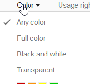
Like the GWMS logo above, you may want a transparent background instead of having the white box around your image. Look under “Color” and choose “Transparent” to find pictures that have that transparent background.

Then scroll through your results and choose just the right picture. The first one on the page is not necessarily the best one for you, so take your time and find one that you really like.

When you find one that you really like, and it’s a good size, click on it to see the actual picture

If you’re happy with your choice, you need to Right click (use a mouse OR click on the bottom right of your track pad OR tap with two figers on the main track pad area)

That will reveal some options for you, including Save Image As, which is what you want

Again, my pal Firefox is a good choice because it’ll ask you where you want to save. If you don’t use Firefox, your image will likely be found in your Downloads folder.

INSERTING YOUR PHOTO INTO WORD

Your photo will pop onto your page really large and will likely shift your content around, so I always insert it BELOW the table, NOT in it.

Go into the Insert menu at the top and choose Pictures

Navigate to find your picture(s). You can actually place more than one at the same time if you like.

Your image will likely be big and will likely be pushed onto a second page.

OR

To POSITION your picture, choose the Layout Options box that pops up in the top right corner of the image.

You can place your picture in a number of ways, but the one we want is on the bottom right, which puts your image in front of your text.

Your image may jump on top of your table already. You’ll likely want to resize it, so grab one of the corner bubbles and resize it. (Click on it if it’s not selected already.)

OR

Drag that in to make your image smaller. You should never really try to make an image bigger! It will lose quality and get pixelated if you try to expand it.

Click and drag the image to put it into place


Put your images on top of your timetable in a place where they won’t block any of your text.

That’s pretty much it! Take a look at your timetable and make sure that everything looks good and is EASY TO READ. Make sure nothing’s cut off or missing.

Try to make sure that everything FITS ON ONE PAGE. There should not be a second page AT ALL.

If you’re SURE that everything is done right and it looks good, you can send your file to me by dropping it off in your OneDrive folder (the one with your name on it!).

OneDrive login

Drop off instructions are here.


Timetable part 2: Layout & Simple Design

As you are working, remember to SAVE your work often (Ctrl + S) and UNDO (Ctrl + Z) if you make a mistake!

Hopefully you checked out the first set of instructions. (if not, go back and do part 1 first!) You should by now have:

  • created your file
  • named it Timetable
  • saved it in either your OneDrive or Documents folder
  • changed the layout of your paper so it is Landscape
  • changed the margins so that they are Narrow
  • inserted your table (11 x 9)
  • merged your title row
  • added the times and school days
  • filled in the periods

Mine looks like this (based on the 605 schedule. Your periods may be different):

Now it’s time to start making things look a little better. Please only start to pretty things up AFTER you’ve filled in all of your information. For any class/project, the most important thing is to get some substance on your page/file. No matter how pretty a project looks, if there’s no decent information on the page/project, you’re not going to do well!

To change the look of your text, first you need to highlight it. Click and drag across to select, or double click to select a word, triple click to select a paragraph.

In the “Home” menu at the top of your screen, you will find a number of tools to change the look of your text.

The easiest thing that you can do to show that you care about how your work looks is to change the style of writing (typeface, usually called a “font.”) Never use the default font. It makes you look lazy! Always choose something that people can ACTUALLY READ. Some fancy fonts are way too hard to read. Why bother writing anything if nobody can read it? Also, don’t choose something that looks really boring and lifeless.

In general, I recommend NEVER using: Calibri (lazy), Times New Roman (so over done and so boring) or Comic Sans (it’s not cute anymore and hasn’t been for a very long time!)

You can also change the colour of your text. Again, make sure that your text is easy to read! A very light colour on a very dark background is a terrible idea. Same thing with dark on dark. You want HIGH CONTRAST, which is a big difference between light and dark (dark text on a light background or light text on a dark background.)

You may also choose to add emphasis to your text by using BOLD, ITALICS, OR UNDERLINING. DO NOT USE MORE THAN ONE! Choose!

SOMETIMES, text looks better in the middle of the page/cell. DO NOT OVERUSE this effect! When writing something for LA class, you may wish to center the TITLE, but DO NOT center everything!

In our case, having the text in your table centered actually looks pretty good, so feel free to center everything here.

DO NOT USE THE SPACEBAR to CENTER! Noooooooo! Don’t do it!

Instead, choose one of the paragraph layout options:

Now my text is starting to look a little better

You may notice that all of your text is lined up along the top edge of your cells, and that it looks bad. Well, you can center your text vertically as well!


You don’t even need to highlight your text, just put your cursor inside of a cell and then choose Layout under Table Tools

You’ll see a series of options. My favourite is to center things vertically and horizontally:

Ahhhhh… much better!

If you find that some text doesn’t quite fit inside of a cell properly, you can change the height of any row or the width of any column by putting your cursor right over top of one of the border lines. In this case, I’m going to choose the line on the far left and drag it left a little bit.


Take your time and make everything look nice. We’ll add some colour and shading and pictures in our next step!


Microsoft Word Timetable (part 1) (605)

You’ve used Microsoft Word many times to type up work, obviously, but did you know that you can create some pretty fun, colorful documents as well? Today we’ll get started creating a copy of your homeroom timetable that you can personalize and decorate however you like.

Here’s my sample. Your finished product should look something like this (click for a closer look):

The schedule for 605 looks like this. You will use this information to fill in your timetable, but you can decorate and change things as you like.

NOTE: You could, if you want, lay out your timetable so that it reads from top to bottom (like the timetables you may have seen in the past.) I’ll show you how to make one that looks like the timetable above (but oh so much nicer!), but if you want, you could do it something like this:

But I’ll show you the standard way. If you want to do one like the one above, you’ll just need to switch your rows and columns around.

You may either read the instructions below or watch the tutorial video below where I will demonstrate step by step. If you choose to watch the video, you NEED HEADPHONES.

Do not watch the entire video and expect to remember anything! Watch a minute or two until I do something, then pause the video, and go do that thing. Once you’ve completed that step, come back and watch a little more.

First, open Microsoft Word and create a new BLANK DOCUMENT

The first thing you should ALWAYS do with any work is to SAVE. Press the File menu at the top left of your screen or press Ctrl + S

 then

Name your file Timetable

Then click More save options

Press Browse to find the correct location for your file

The easiest and safest place to save your work is in your DOCUMENTS folder.

Then click Save

You’ll know it’s saved correctly when you see the new file name appear at the top of your page

The program will start to AutoSave for you if that switch is turned On, but you can also press the button next to that to save your work at any time

Now we can start to set up our page properly.

Clic on the Layout menu at the top of your screen

Then choose Orientation

And switch your page orientation to Landscape to turn your paper sideways so that it is wider than it is tall.

One more thing that really helps. Again, in the Layout menu at the top, choose Margins and change those to Narrow

Now that the page is set up, we can put something on it!

In the Insert menu at the top of the page, look for Table. Click that, then below the boxes that appear, choose Insert Table

You want your table to have 11 columns and 9 rows

Now make sure that you can see your whole page. At the top of your screen, choose View, then select One Page

If you have your cursor in or on your table on your page, you should see a box at the bottom right. You can click that and drag it out to expand your table to fill up the page.

Here’s what the whole page should look like:

BE CAREFUL when you pull that table down to stretch it that you DO NOT GO ONTO ANOTHER PAGE! We want this all to fit on one page, so don’t pull too far!

This is BAD:

This is GOOD:

You’ll notice on my sample that some of those boxes (called CELLS) are joined together to make one wide box/cell.

To do that, click in the top LEFT cell, then hold down shift, and click on the top RIGHT cell to select all of the cells in that row OR click inside the first one, HOLD DOWN YOUR MOUSE BUTTON and DRAG to the right. You’ll know you’ve got this right if that top row (and only that top row) turns grey:

Once you have those cells selected, you should see a menu section at the top called Table Design.

Click the Layout tab on that section, then find where it says Merge Cells

That button should join your top row cells and create one big wide cell. Now you can start filling in some of your cells, as you see below. Obviously you’ll put your name at the top instead of mine. Duh!

You may also choose to MERGE some of the periods that might be the same every day (optional!) So if you do the same thing every day during your morning break, maybe you just want one big cell instead of 6


There are two empty cells at the top left that I like to merge

NOTE: When you type in your name (or spell something wrong) you’ll see a red squiggly line underneath. That’s just Word checking your spelling as you go and letting you know that it doesn’t recognize a word. It doesn’t really know names, so often those will not be in the program’s dictionary. Often, though, it’ll alert you to the fact that you actually made a mistake (it happens!).

To check what the problem is, see a suggestion, and either change the spelling or ignore, RIGHT CLICK on the underlined word(s). In my case, I like to write my name like that, so I can just tell Word to ignore that weird word:

Sometimes, though, it’ll point out a mistake that you may not even realize that you made. Here’s one that happens a lot:

You can just click on the corrected spelling and the program will change the word and get rid of that red line

Fill in the rest of your periods! You may borrow a paper copy from the black binder at the front of the room if you need one or scroll up to the top of this page for a photo of your class’s schedule.

You may, if you wish, fill in the periods however you like! If you want your day full of eating. sleeping, and Fortnite, go right ahead! I do think that these are really helpful to put in your binder or in your locker, and I’ll be glad to print a copy for you to use if you want to make an accurate schedule.

The periods below are accurate for someone in 605 and are just an example to anyone in any other class. Don’t forget to use Bold, Italics, or Underlining to make things stand out:


SAVE YOUR WORK!

Press the File menu at the top left of your screen or the little save icon 

OR press Ctrl + S

 then

Welcome (Back?) to your Computer

Whether you’re brand new to computers or a veteran, it’s good to go over some things that you should know and do before you get started working on your (super fun) projects.

First, log in. Your user name is: your first initial a dot, then your last name (some people add a number afterward)

ex: g.waters
or: g.waters2

Your password is: The first three letters of your first name (CAPITAL ON THE FIRST ONE ONLY) then the first three letters of your last name then the last 3 numbers of your student ID

ex: Geowat123

Remember to keep your log in SECRET! You do not want anyone logging in as you and messing up your work or doing something bad that you will get blamed for!


***************************************************************

For the next section, the video immediately below will show you everything that is written below that, so you can choose to either watch the video, read the instructions, or both!

Once you’re logged in, your desktop will look something like this:

You will see a couple of quick launch icons on the desktop and a Recycle Bin where files go when you delete them.


Down in the bottom right you’ll see a Start button

Clicking that gets you an area where you can open programs and sometimes see information like the weather:

Next to that is a search bar:

You can use this like Google (even though it launches another horrible search engine called Bing. It should be called Barf.)

Typing in a question or something like that will initiate an Internet search:

You can also ask it to do things like convert units for you:

And it will display the results for you:

This is a great way to get the answer to simple math questions and things like that!

You can also use this bar to launch programs. Type in the name of a program you want to open (like my favourite Internet browser, Firefox):

And it’ll give you a quick link to launch that program:

Beside that, you’ll see something called the Task Bar, which includes links to commonly used programs (and a couple of useless ones…)


That blue E launches a horrible browser that no sane person should ever use. I get tired of seeing it there, but you can remove it by RIGHT CLICKING on it. To RIGHT CLICK you either use a mouse and click the button on the right side OR tap on the track pad on your laptop with TWO FINGERS AT THE SAME TIME (NOT the same thing as a double click!)

When you RIGHT CLICK, you’ll get the name of the horrible program and the chance to Unpin it from the taskbar so you never have to see its ugly face again. Do it!

Next to that piece of junk is a program that we use A LOT! This program is called File Explorer and it helps you to locate, open, move, or rename files (or a whole bunch of other cool options!)

Opening up File Explorer will launch a window like this:

On the left, you will see a bunch of common locations. DOCUMENTS is one of only TWO safe places to save your files. If you save files into DOCUMENTS, you will be able to see them from any computer in the school:

Down in the bottom right corner there are two options for viewing your files, one is a list of details, like you see above. If you click the other one, you can see a “thumbnail” preview of the file:

Now those same files look like this. This allows us to know what a picture is of without opening it.

Next to that is another totally useless program:

Get rid of that one too!

In the bottom right corner you’ll see a few things as well.

You will see whether you’re connected to the Internet or not with the little wi-fi icon. Sometimes that gets turned off for some reason. If you can’t connect to the Internet, check to make sure that is turned on.

If you can’t connect to the Internet, you may be on Flight Mode for some reason. If that’s on, you can’t connect.

OR…

Sometimes Mr. Robson will catch you doing something you shouldn’t be doing on your computer (I see EVERYTHING!) and will turn off your Internet!

You can also see how good your battery is on the laptop. If they don’t get plugged in properly they can get low. You should notice before it dies!


There’s also a little arrow that you can click to Show hidden icons:

One of those icons connects you to OneDrive. OneDrive is where you will drop off your work to me and also a great place to store your files so that you can have access to them on ANY computer or device, even when you’re not at school.

See the OneDrive post for more information about how & why to use that application/site!


Internet Browsers

For this post, the video immediately below will show you everything that is written below that, so you can choose to either watch the video, read the instructions, or both!

There are 3 Internet Browsers on your computer that can connect you to websites, Firefox, Google Chrome, and Microsoft Edge (YUCK!)

In a previous assignment, you should have seen how to customize your Task Bar area (at the bottom of the screen) to remove that yucky browser (and the Microsoft Store, which you’ll never need.)

You should also have seen how to open a program. You can either use the Windows menu at the bottom left of your screen

Or use the search bar and type in the name of the browser you want. I use Firefox, so my demonstrations will focus on it. I recommend using it as well unless you’re used to Google Chrome. If you’re used to that other thing, CHANGE YOUR WAYS!

Once you have a browser open you’ll see it in your Task Bar. To get it to stay there (it will only “stick” on the computer you are using today, so if you switch computers, you may want to do this again), right click on the browser icon

And then choose Pin to taskbar

If you choose Firefox (good for you!) it will probably ask you if you want to make it your Default browser

Look for the Web browser section and click it, then click your chosen browser

That dumb Microsoft browser likes to make sure that you want to switch. Of course you do! Click Switch anyway


Visiting websites:

The top bar *can* be used to search for a site or topic, but if you know the address of a website, you can (and should) just type it in to go directly there.

Go to my site by typing in misterjrobson.com (you’ve already done this, obviously. Good job!)

Hit enter and you will be magically transported into Mr. Robson’s World

This is a site that you will need to visit a lot, so there are a couple of ways of getting here even more easily in the future

One is to add a Bookmark. You can click the little star to the right of the address bar to add a Bookmark. If the star is blue, you’ve already got one!

You can type in a custom name for the bookmark or just take whatever comes up

I like to make sure that my main Bookmarks go on my Bookmarks Toolbar

If you have that toolbar turned on, you’ll see a handy link to my site right in your browser window at all times. All you need to do is click it to be transported!

You can also edit or delete Bookmarks. I don’t use the Getting Started, so I like to right click on it and Delete


There are a few options that you can explore inside the “Hamburger” menu on the right hand side of your window (optoional!)

You can actually create a Firefox account so that you can save your preferences, like those bookmarks, and have them the same on every computer you use. I like this feature a lot.

You can also make sure that Firefox will start up exactly where you left off after you close the program by making sure that it will Restore previous session

We’ll talk more about this later, but you can also set where your Downloads go, or can choose to be asked every time:


Using OneDrive

For this post, the video immediately below will show you everything that is written below that, so you can choose to either watch the video, read the instructions, or both!

Click the little cloud to open the OneDrive app:

Click Sign in to, uh, sign in…

Sign in is your computer user name @sjasd.ca

ex:  

That should take you to another login page where you’ll put your password

On the next screen, you need to press Next

And then one more time to start to connect your computer to your online folder:

After that, there’s a little tour you can take if you want:

Or just Close the window:

Now you actually have a new folder on your computer where you can safely store your files AND back them up online automatically:

Now in your File Explorer window you’ll see a OneDrive folder:

Anything you put in that folder will be automatically uploaded online. You’ll know that it’s backed up when you see a green check mark on the file.


Audio Editing Introduction

Starting today, we’ll discover the wonderful world of audio editing!

You’ll need to download this file: CLICK HERE

And then open it with 

When you’re done, your file should sound something like this, but NOT EXACTLY

Once you’ve downloaded the file (you have done that, right?), you’ll have to open Audacity

Then you’ll have to press Ctrl + O or go to the File menu and press Open

SAVING YOUR WORK

Please note: SAVING IN AUDACITY IS DIFFERENT than you’re used to!

When it comes time to save your work at the end of the class, you need to EXPORT your file to WAV

Once you’ve exported the WAV, you DO NOT have to save the project! If you try to save the project in your Documents folder it WILL NOT WORK.

Part 1: Reorganizing Audio

The first section of the file is in the wrong order. It should say:

Welcome students, to the wonderful world of audio editing. Once you learn how to edit audio, anything seems possible.

So you’ll have to rearrange the lines. To do this:

Click the magnifying glass with the + sign inside of it. I would click it TWICE if I were you.

Once you do this, the timeline at the top should look like this:

Each number represents a second of audio. You are editing the first 11 seconds only right now.

The section from 10 seconds to 11 seconds is actually the piece that should go at the beginning. Click on screen where those waveforms are and drag across to highlight like this:

Once you’ve got it selected, you just need to CUT by pressing Ctrl + X or the scissors on the top tool bar

Press the Home button on your keyboard to jump back to the beginning of your file.

Then press Ctrl + V or the clipboard on the tool bar at the top to paste

The second block, from around 2 seconds to around 4 seconds, actually goes at the end. Click and drag across to highlight

Go to the space between 8 and 9 seconds and paste


Only one more piece to move! Take the section from about 4 seconds to about 5.5 seconds and highlight that

Cut and Paste that section at about the 2 second mark

Now listen to your newly reorganized section to make sure that it sounds OK. If there are any extended gaps that don’t sound good, just delete some of the silence.

Something else that we should check regularly is the volume of a section. You’ll notice in the file that some parts are louder than others (the waveform bubbles appear larger.)

If you find a quieter section, or just want to check and make sure that the volume is right, just highlight the section (like this newly edited 12 seconds or so)

Then look under Effects and choose Normalize

Don’t worry about what the box says for now, just click OK

This particular section won’t change a lot, but it will get a bit louder and it’ll be at the ideal volume.


Section 2: Fixing Mistakes

Sometimes when you’re trying to record audio you stutter or stumble and make mistakes. No problem, it’s very easy to fix!

Look at the section from about 12 seconds to about 26 seconds. I stutter a lot, so we need to get rid of the bad bits.

The section at about 16 seconds is pretty good. It says, “You can fix.”

Highlight the section before that (about 12 to 16 seconds) and delete (Backspace) or cut (Ctrl + X) that

There’s another pretty messed up section from around 13 to 21 seconds

Get rid of that as well and you’re left with this

Again, listen to it to see if there’s too much space between the words or anything. On my example below, there’s too much space so it doesn’t sound natural

Highlight the extra silence and press Backspace or Ctrl + X to bring the words closer together


Section 3: Audio Effects


Now for the fun stuff! The section from around 15.5 to 21 seconds needs to be higher. Select that part.

I notice that it looks a little quiet, so I’ll Normalize first


Then go into Effects then choose Change Pitch

There’s a little slider down near the bottom that controls the change in pitch. You can also click in the Percent Change box and type in a number. I like to raise mine about 50 percent, but feel free to play around and find a number that sounds good to you.

You’ll need to click Preview to see how it sounds before you accept a change

If it sounds good to you, click OK and move on to the next section from about 22 to about 25 seconds

Again, it’s quiet, so I’ll Normalize

This time, you want to move the percentage down (negative). I used -50 percent (but again, play around a bit. Just don’t get too carried away. We still want to be able to understand what’s said

The next section is from about 27 to about 29 seconds. Highlight that.

We need to speed that up, so go into the Effects menu and choose Change Speed…

Again, you can use the slider or type in a percentage number to change. I like about 50 percent. Make sure you Preview to see how it sounds before clicking OK

The next section is right around 30 seconds

To slow it down, move the slider to the left or type in a negative number (I liked -50). Again, preview before clicking OK.

After that, there’s a long section from about 35 to 42 seconds that needs to be turned backwards.

Under Effects, choose Reverse

The next section is from about 45 seconds to 47 or so

You have two options here.

  1. Choose Echo…

Or…

2) Reverb

I notice that mine now looks really qiet, so we should definitely Normalize

The next section is from about 48 seconds to about 51

This time, we want to go into Effects and choose Distortion

To preview this, choose Start Playback

And then instead of OK, you’ll click Apply

That one looks a little quiet again, so Normalize it


Section 4: Inserting Sound Effects and other Audio Clips


You’ll need at least 3 sound effects. There are lots of places to get sound effects, but we want ones that are free and legal.

A great one is the BBC Sound Effects Library

I also like THIS SITE. The problem with that one is that you can’t really preview most of the files, which is a bit of a pain. Some pages will let you (like these space sounds) but not all.

THIS ONE is also pretty good. Pick a category and browse (the search function doesn’t really help)

You can sample the tracks by pressing play

Then you have to click on the name of the sound to download and save

Once you have 3 (or more) sound effects downloaded, you need to Open them in Audacity

You can actually open all 3 at the same time by selecting more than one (click on one and then hold down Shift to select a range OR click Ctrl to select files one by one)

Then, one by one, go into each file, highlight the part you want to use (or the whole thing if it isn’t too long)

Then Copy (Ctrl + C or the two sheets of paper between the scissors and the clipboard)

Find the spot in your editing exercise file and paste in the sound effect


Trim the sound effect if it’s really long (a few seconds should do it)

or just select a piece of the file you downloaded and copy that

The last part is to find a sound clip that you can insert at the end. A movie clip can be found here

LOTS of them don’t work, unfortunately, so you might want to download a few just in case

Paste your clip at the end

And you’re done!

Remember to EXPORT as WAV! You DO NOT need to save your project IF you’ve exported the WAV

Save your WAV in your ONEDRIVE or DOCUMENTS folder

Keep the file name the same

Then go to Teams and drop off your 01_AudioEdit_intro.wav attached to the Audio Editing assignment.