Category Archives: 819Computers

Celebration of the Arts Poster 2020

This year’s Celebration of the Arts is coming up in May, and we need your help to spread the word about this great event! We’d like you to create a poster on Photoshop Elements informing people about the event and getting them interested in attending.

You will make this using the same steps as the GWMS Poster assignment. Look back at those instructions for help with how to do this.

Your poster should be set up the same size as the GWMS poster you did previously:

17 inches high x 11 inches wide

or

11 inches high x 17 inches wide

Or, if you think you can do a really great job of designing something beautiful and exciting, try a bigger size if you want:

24 inches high x 18 inches wide (or 18 inches high x 24 inches wide)

Here are some examples of a few of the better posters last year (click them to see them bigger):

REMEMBER: the information in the posters above is for LAST YEAR. DON’T COPY IT.

This year the Art Show details are:

**********************************

GWMS Celebration of the Arts
May 14, 2020
6:30-8:30pm
Doors open at 6pm

visual art, band, drama, a movie premiere, and Dance.

Cost:
$5 per child (5 years old and under free)
$10 per adult
*$25 per family ($30 at the door)
*(max. 5 people; 2 adults, 3 children)

Payments can be made through School Cash On-line on our school website or here: http://bit.ly/gwmspayments

or tickets can be purchased by cash or cheque at our school office

**********************************

Any images used need to be high quality, and copyright free/creative commons. Use one of these sites:

https://unsplash.com/

https://www.pexels.com/

http://compfight.com/

Or, even better, ask to borrow a camera and take a picture of some artwork, dancers, or the school!

Microsoft Word Menu/Price List

Now that you’ve demonstrated a mastery of some important and impressive skills in Microsoft Word, it’s time to put those skills to work to design an amazing, useful document of your own!

You’ll design a restaurant menu, business price list, or some creative way of demonstrating your knowledge.

Here’s my example. Yours does not have to be exactly the same (and it SHOULD NOT BE):

Displaying the invisible characters, it looks like this:

You can make up your own store/business or create a menu for a restaurant using this format. Have fun and be creative, but you MUST INCLUDE:

  • Text formatting (font, colour, size, alignment)
  • Pictures (behind text and square or tight)
  • Text box(es) (including borders and shading)
  • Hyperlink(s)
  • TABS TABLE! (I set tabs to line up my artist (left), title (center), and price (right) – yours can have more/different columns, but you NEED TO SET TABS somewhere)
  • Bonus for more tricks & tools that you used in the previous assignment, so add in more of the things that you’ve learned!

Word Skills part 3: Tables

Two more sections to go! The first one is pretty easy (you’ve done it before!)

First, position your cursor wherever you want your table to go

Make sure you’re on the Insert tab/menu, and click on the Table box. Your table should be 4 x 4

Type or copy and paste to put your headings in your table. You can do it two different ways:

Most common:

but if you want to be a little different, this works too:

Then just go fill it in. You don’t really need to ask 3 people. Feel free to just make up answers and put those in (I did!)

The table is a bit hard to read unless you make the headings stand out from the data. Highlight those headings

And then use the paint bucket to shade those boxes in

and center the text inside of the cells

That looks MUCH better:


SETTING TAB STOPS

This is another way of making a table that can be much more effective and useful. It also tends to look pretty good if you do it right. It is new and kind of difficult the first time, but I’ll show you exactly what to do.

Something that really helps when you’re working on this section is to turn on the button that shows you all of the characters in your document that are normally invisible, like spaces, every time you hit enter, and every time you hit tab.

Normally, when you’re typing out information for this type of table (as you will do in your next assignment… hint hint…), you would type an entry then press tab, type the next bit of information, then press tab again, and so on. I’ve inserted the tilde character ~ to show you where the tabs should go

So the first thing we need to do is get rid of those tildes and put the tabs in. Luckily, there’s an easy way to do it all at once.

Make sure you’re on the Home tab

Over on the right, you’ll look for the button that says Replace

You want to search for and replace all of the tildes, so that goes in the top box where it says Find what:

You want to Replace with: the tab character. If you just press the tab key in the box, it exits out of the box, so that doesn’t work. There are two ways to do this instead:

Down at the bottom of the box, you can click More >>

then 

and look for Tab character

OR

You can type in (or copy from here…) ^t

Your box will look like this:

Then you want to Replace All

If you have that Show/Hide button on, your paragraph will look like this: (the arrows represent the tab character

Without that button on, it looks like this:

Hopefully, you still have your Ruler showing, because you’re really going to need it

Right now, those tabs are stopping all over the place, so the paragraph is a big mess. but we can tell the Tab key to stop in specific spots to line things up properly.

Look at the very top of the ruler on the left-hand side of your page. You’ll see a little character that might look like an L (although it could be something else…)

that little L represents a Left tab stop. It will line things up on their left-hand side. The first step is to go and set 5 of these stops on the ruler. Yours DO NOT have to be in the exact same spot as mine, because we will end up moving them later anyway

The first one goes really close to the margin. Go and click on the top ruler somewhere between the margin and 1. 

the next one should go somewhere around 5

the third one put around 11 or so

I’ll put the third one around 18

The last one should go right near the right-hand side of the margin

Now we need to change some of those stops to line up in different ways. In order to do this, on the Home tab/menu, right below where you’d add borders or shading, in the Paragraph section, click the little box with a diagonal downward-facing arrow:

That opens this box:

Down in the bottom left corner, there’s a Tabs… button. Press it:

That will show you a list of the stops that are currently set and will allow you to move, change, or delete them

I have given you instructions explaining which types of stops I want. The first one is called Decimal. It’s good if you are working with numbers, because they will always be lined up along the decimal point

I have the first one set at .5 cm. (yours might be slightly different) Whatever your first one is, make sure it’s selected (click on it if not)

Down in the Alignment section, you can choose where that stop lines up. Click Decimal

Then move on to the second one and select it. Mine is at 5 cm

This one should be lined up on the left

My third one is at 11 cm. It should be Center aligned

My third one is at 17.75 cm. It should also be Center

My last one is at 24.75 and it needs to be Right aligned

NOTE: if your stops get really messed up or you end up with too many or something is wrong, you can always Clear a stop by choosing it and clicking Clear

If you need to start all over again, just click Clear All

Once you’ve set your stops like mine, things should actually look pretty good already. The table of information is now lined up and organized

I don’t really like how my last two columns are so close together

I’m going to go up to my ruler, find the second last one, and move it over to the left.

NOTE: you have to be very careful clicking right on the ruler. If you click right on the little symbol, it’ll work fine. If you click close to the symbol, it’ll add a new stop and will cause problems. Make sure you only have 5 at all times. If you add one by mistake, you can go back into the Tabs box and clear it OR just carefully pull it down off the ruler.

I started here:

And moved it here.

Now I have a decent amount of space between the last two columns

I find my second and third stops a little too close as well

So I’ll move that second one over to the left a tiny bit.

Start:

Finish:

That looks much better to me

Now my list of stops looks like this (again, yours might be slightly different)

When I turn on that Show all characters button

The table now looks like this:

NOTE: Sometimes things won’t be lined up still. Occasionally when you’re typing in your information, you’ll accidentally get two Tabs inserted where there should only be one, and things will not line up properly

If that’s the case, you need to remove one of those Tabs to make things line up

The final step is to take the headings for the table and make them stand out from the data below so that it’s easier to read and understand.

Highlight the top row

and change the colour, make it bold, underline it, or somehow change the look so that it’s obviously different from the data below. I’ll make mine Bold (Ctrl + B) and Underline it (Ctrl + U)


Take a minute to scroll through your document and make sure that everything is done and everything looks good. Move things around or make changes if you need to.

Once you’re done, SAVE your work. CLOSE the file. Follow the steps to DROP OFF.

My finished document looks like this: wordskills

Word Skills part 2

PAGE LAYOUT

Switch to the Layout tab/menu

Change the Orientation to Landscape

Change the Margins to Narrow

Normally you should set your margins and orientation BEFORE you start a document because things will move around after you make that change. Scroll up through your document and see if anything looks bad now.

My shape moved over into the margin, which doesn’t look good, so I should move it.


INDENTS

For this section, you really want to make sure that you can see the rulers at the top of your page. Usually they’re on automatically, but you can check by going into the View menu/tab

Make sure that Ruler is turned on

There are 3 ways to indent a paragraph. To choose your paragraph to indent, you DO NOT need to highlight just put your cursor in there anywhere

There are 3 different points on the left-hand side of the ruler at the margin. There is a triangle pointing down, a triangle pointing up, and a little rectangle on the bottom.

The most common type of indent is just to move the first line over and leave the rest alone. You can accomplish this by moving the downward-facing triangle or just going to the start of a paragraph and pushing the Tab key. You don’t have to demonstrate that for this assignment.


To indent the entire paragraph, use the rectangle at the bottom and slide it to the right on the ruler.

That will move the entire paragraph over


Again, put your cursor in the paragraph you want to indent

And this time, grab the upward facing triangle. NOTE: the three pieces are VERY close together. I find the Hanging Indent to be the most difficult because you have to precisely position your cursor to grab that pointer.

Click right on that upward triangle and move it over. The downward facing triangle should stay where it is.

This will leave the first line alone and move all other lines over.


HYPERLINKS

To insert a Hyperlink, you’ll need to go on the Internet and find the website that you wish to link to. For the first one, you need to find the St. James Collegiate website

At the top of the screen is the address of the site. Click it and it should turn blue (click and drag across to highlight if not)

COPY that (right click OR Ctrl + C)

Go back to your document. You need to highlight the text that you want to attach the link to.

The easy way to add a link is to press Ctrl + K. You may also go into the Insert tab/menu

and click Link

click in the Address box

and Paste in the address you copied (right click OR Ctrl + V)

Once you press OK, you’ll see that the text  turned blue and has a line under it. If you click on that text, it should take you to the website.

Do the same thing for George Waters and Mister Robson.


WORD ART

There are two ways of doing this, and your preference depends on what you want to do with the word art.

Method 1: highlight the text

On the Home tab in the area where you changed the font & size, you’ll find a blue block letter A. Click that and you can choose one of the pre-made styles or you can play with the different options below

If you use that method, your text is just like any other text, except it’ll be a bit fancier.

Another way of doing this allows you to move the text around like a picture.

To do this, you will want to highlight the block of text and CUT (Ctrl + X) it

Switch to the Insert tab/menu

Over where you made your text box, you’ll find a Word Art button

That’ll give you many of the same options as you saw in method 1. Choose one and it’ll create a text box for you in that style.

Paste your text into that box, and now you can move it around like any other text box or picture, which allows you to do more with it

IMAGES

Go to Google Images and search for a musician or band (or actor or character or whatever) that you really like.

Below the search box, click Tools

To find the best quality images, click on Size and choose Large

Optional: If you chose a cartoon character or animal or logo of some kind, you may wish to find one that has a transparent background. To do this, click on Color and choose Transparent

Once you find an image that you would like to use, click on it and you will see a preview on the right. Right click on that and choose Save Image As (or Save Picture As)

If you’re using Firefox or Chrome, you may be asked where you want to save the file. If you don’t necessarily need it after today, you can go ahead and save it in Downloads. If you want to use it again sometime, you can save it in your Documents folder.


While you’re on the Google Image results, you need to click on the link to visit the site where the picture originates because I want a link to the picture’s source

Underneath the photo on the right, you will see the title of the site where it comes from, and it will be a link that you will click on

Go to that site and copy the address, just like you did when you were adding Hyperlinks before

Moving back to your document, you need to be on the Insert tab/menu and choose Pictures

Go find the photo (probably in Downloads)


And insert it 

If you’ve chosen a large, high quality photo, you may wish to resize it. Click on the photo and you will see little bubbles around it. Grab a corner bubble and bring it in to make it smaller (NOTE: NEVER try to stretch a photo this way!)

Now you need to Insert a Link, just like you did on text earlier

If you hover your cursor over top of the image, you should now see the address of the page in a little box. NOTE: that link/address should NOT say Google anywhere in it. Google just shows you where to get the photo, no photos are actually housed by Google


PHOTO LAYOUT AND TEXT WRAPPING

Now you need to change how that photo sits on your page and what happens to the text near it.

To do that, click on the picture to select it and you should see this little box near the top right corner:

To position text around the photo, choose either Tight (this looks neat with a transparent background, say around a logo or animal) or Square

Now you’ll see the text wrap around the image

You will insert another photo in the background of your page

This time, change the position to be Behind Text

The photo will probably make your text really hard to read, so it’s important to fade it out

When you click on the image, you’ll see the Picture Tools/Format tab/menu

There you will find Color options

Hover your mouse over any of the options and it will show you its name. You want the one that looks really faded (Washout)

Which will make it much easier to read the text on your page

Now on to Step 3!

Microsoft Word Skills

A lot of this you should be able to do on your own, because you learned most of it last year. A lot of the tools are very similar to ones that you’ve used in Excel and PowerPoint as well. Some of this is brand new, so you may need to follow some directions to complete the assignment. Feel free to go through the whole document and see how much you can do before you start looking at the directions, just make sure that you do every part before handing this in (including the last part, which is the most important and most challenging)

download this file

Your finished file will be a Word document (.docx) but will look something like this: wordskills_SAMPLE

Start by saving your file into your OneDrive folder

You’ll know that it’s saved properly when AutoSave is on

TEXT FORMATTING

In order to make a change to specific text, you need to highlight it. Go line by line (or if you want to get fancy and do one block with all of the attributes at once, go for it)

OR Ctrl + B

OR Ctrl + U

Note: you can do different styles of underlining with the little triangle/hidden menu

OR Ctrl + I

In the end, the first section might look something kind of like this:


TEXT ALIGNMENT/JUSTIFICATION:

Note: You DO NOT have to HIGHLIGHT the text to change the justification of a paragraph, just make sure that your cursor is inside of that paragraph when you change how it is aligned

Your properly aligned text might look like this:


BORDERS & SHADING:

Again, you DO NOT have to HIGHLIGHT the text in order to add borders & shading.

You can add simple borders with this button: 

OR

At the bottom of that box, you can open more options to further customize your borders & shading (recommended!)

Pay attention to the three tabs across the top. You’ll need to use them all. Also make sure that for the first part, you Apply to: Paragraph

For SHADING, DO NOT USE THE STUPID HIGHLIGHTER! IT IS STUPID!

You can add simple shading with the paint bucket:


TEXT BOXES:

 Switch to the Insert tab/menu at the top of your screen

A Simple Text Box is fine (although feel free to play around and choose something a bit fancier if you like)

Delete the text that is in the box. It’ll be highlighted already:

You can click on the edge/border of the box and drag it to move it around on your page:

Highlight the paragraph you want to put in the box

Use the scissors OR right click OR Ctrl + X to CUT

Click inside the text box to place your cursor:

And PASTE (Ctrl + V or right click or the clipboard button)

To change the look of the text box, click on the border around it to select it

Once again you can use a simple border or open Borders and Shading

You have many more options if you open the Borders and Shading box

The shading could also be simple or fancier

The text box now looks a lot more interesting


PAGE BORDER & SHAPES

For this one, you need to open that Borders and Shading box and choose the Page Border tab at the top

For this one, you can choose a simple border just like you did for the paragraph and text box…

OR…

You can add some goofy art to the border around your page. You can change the size and colour of the “art”

WARNING: Those “art” borders look really cheesy. I would NEVER really recommend using almost every option available there because it looks really terrible, but just to try it out, have some fun here.

Whatever you choose, you can apply it to the Whole Document or just a section of your document

Now I have small blue musical notes around my page

We used shapes last year to make your trading card, so hopefully you remember those, but just in case:

Switch to the Insert tab/menu

Click on Shapes to choose a shape

Choose whatever you want

And then click and drag on your page to draw the shape

To change the look of the shape (you always should!) click on it to select it

At the top of the screen a new tab/menu will pop up

You want to change the Shape Fill and the Shape Outline

Mine now look like this:


PAGE BREAK

A Page Break is just a command that tells the document that everything to follow should be on a separate page. You might be tempted to just want to hit enter a few times to move everything down, but when changes occur to your document overall or above, that space becomes incorrect. The Page Break makes sure that no matter what, a new page will start at that point always.

Put your cursor wherever you want the break to occur

On the Insert menu/tab, choose Page Break

to be continued in Step 2

Tell the World about #myGWMS

We’re looking to show off the great people, programs, opportunities, and just the all-around fun that happens here at George Waters. If you’ve got something that you love about our school or something that we should brag about, here’s your chance! Share your idea and you could end up in a video, on social media, in a poster, or even on a button or t-shirt!

Excel Timetable – part 3 – Printing

Make sure that you’ve finished ALL of the steps in creating your timetable before you attempt this one.

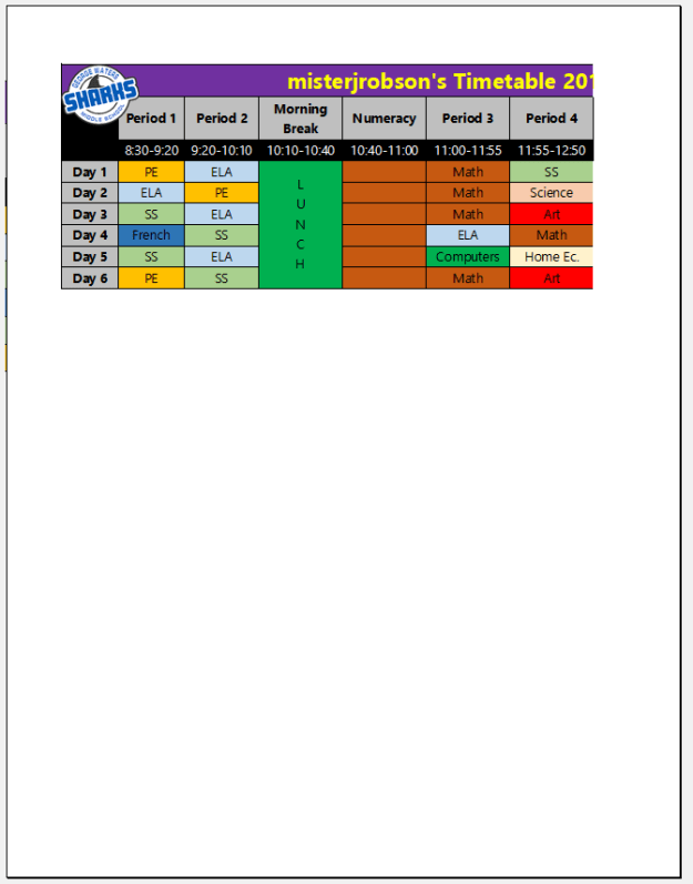
Your timetable should look something kinda sorta like this:

Excel is a lot like Microsoft Word in many ways that we’ve seen so far, but it also has some big differences. When we set up our Timetable last year in Word, we started by placing it on a file that would eventually print out on a standard sheet of printer paper (8.5″ x 11″). But Excel isn’t really set up for creating documents the same way. To see this in action, go to File and Print (NOTE: PLEASE DO NOT ACTUALLY PRINT OUT YOUR TIMETABLE!)


Start by pressing Ctrl + P  or going into the File menu

and selecting Print

Make sure you select Microsoft Print to PDF!

You’ll see a preview of your page on the right…

No good! It’s cut off on the right hand side!

There are some settings that will help, though.

The first one should probably say Print Active Sheets. That will work for us.

OR

You could go back and highlight the stuff you want to print (your timetable) and then choose Print Selection

Our timetable is a lot wider than it is tall, so flip that paper so that it is Landscape Orientation

You may also wish to cut down the amount of white space around your timetable by making your Margins smaller. I like Narrow

That might do it for us, but you can also Scale the size of your print to fit all of your columns on the page as well

That’s not bad

But you may wish to fill up the page even more! I’m going to press Esc to go back to see my work again

You’ll notice a dotted line around your work. That represents the edges of the page if you were to print it out. Currently, there’s a LOT of room left on that page

What I like to do is highlight the rows for Day 1 to 6 (for me that’s rows 4 to 9.) Click on one of those numbers on the side, then hold Shift and click on the last one to highlight those entire rows

As I showed you before, you can adjust the size of your rows or columns. With all 6 days selected, you can adjust them all at once and make sure that they stay the same size

Click at the bottom right between the last row of your timetable and the first blank row (for me that’s between 9 and 10)

Pull that down A LITTLE BIT / SLOWLY

and you’ll see some of that extra space start to disappear

If you keep slowly and carefully adjusting (and/or pressing Ctrl + Z to Undo if you go too far) your rows will get deeper but you won’t go onto another page

And you’ll end up with very little space left at the bottom

Resulting in a much nicer looking page to print

Here’s one more look at the settings I chose to make mine fit on the page well


So long as you’re sure that you’re on Microsoft Print to PDF, you can now hit Print

Rather than spitting out a piece of paper, this will give you a file to drop off, which I will give you marks for and print for you. Save it into your Documents or OneDrive folder

and then drop it off!

Excel Timetable – part 2 – Formatting

After following the directions in STEP 1, you should have something that looks kinda sorta like this:

If not, go back to the posts for your class and follow those directions until you do have something kinda sorta like that. You should ALWAYS FILL IN YOUR INFORMATION BEFORE YOU MAKE IT PURTY! Don’t start messing around with colours and pictures and stuff unless you’ve actually got something to purty up!

Now that we do have everything filled in, let’s make it purty!

See that top line? That’s a headline. Let’s make it stand out!

You can make it BOLD


use ITALICS


Underlining:


I like BOLD for a title, personally


But it should also be a little bigger as well

That looks better!


It might be nice to have things like the periods stand out as well, so I’ll BOLD those as well:

Time for a splash of colour!

As usual, click on any cell to select it

Look for the paint bucket to fill

and choose your colour 

But say you don’t want to do things cell by cell (who would?) You can select a range of cells by clicking and dragging (or clicking then holding down Shift or Ctrl and then clicking on another)

Let’s say that you like the look of a cell and you want other cells to look the same way (same font, size, colour, shading, etc.). Select a cell (like my Period 1)

Double click on something called the Format Painter

You’ll see a dotted line around the cell that you’re going to copy the formatting from

and then you can go and click (paint) to apply that formatting elsewhere

  becomes 

Now the two areas match

I like to make all of my subjects look different, but all of the classes for each subject look the same. Choose a look for one of your subjects

And double click that Format Painter 

Go paint that on the rest of the classes for that subject

Carry on and do the rest of your courses!

One thing to watch for. Sometimes if you fill a cell with a dark colour, your text will be rather hard to read

So you might have to switch to a lighter colour for your text

Something else that makes things look a lot better is having borders around the cells. When we used Word, they were already there, but here, not so much, so you have to turn them on

Select your cells but DO NOT INCLUDE ANY EMPTY CELLS

Beside the Shading paint bucket there’s an option to change your borders.

Much better!

You may wish to Merge some of those big blocks. You may have different things going on in your schedule on different days of the cycle, but probably not. If you go to Pokemon Club every Day 2, maybe you want to put that in, but if not, how about one big lunch break. Once again you can select a range of cells:

And use Merge & Center to join them

Or perhaps you just want to hide the borders and still have individual cells there:

Maybe you want to label those

If you want, you can change the orientation of the text in the cell. Select it:

The only thing left is to add some logos/pictures!

You may wish to add a GWMS logo. You can get those from HERE

OR

You can go to my LINKS page (or your class Assignments page)

Find a logo you like (.png is my favourite because it has a transparent background, but .jpg will work too)

Click on whichever logo you like

Then at the top right corner, click on Download, then Direct download

Depending on your browser, it will probably go directly into your Downloads folder. If you get a window like this (Firefox), make sure you Save the file

Go back to your spreadsheet and click Insert

then Pictures

Look in youur Downloads folder for the file and Insert it from there

You can click on it and move it easily

But it’ll likely be rather large, so you’ll have to resize by grabbing a corner and pulling in. Please HOLD SHIFT while resizing, so the shape of the picture doesn’t distort!

Put in as many photos/logos as you like, but make sure that you can still read/use your timetable!

As always, SAVE your work!

There’s one more nifty step! You’ll have to drop off an Excel file (.xls) AND a .pdf file. We’ll show you how to do that in the next set of instructions!


Excel Timetable – part 1 (819)

With the new school schedule to get used to, I thought it might be good to revisit our first assignment from last year, but do it in a new and interesting way. Again you’ll create a copy of your class schedule (or perhaps the schedule of your dreams) but we’ll use a different program this time, Microsoft Excel.

Excel is usually used more for math formulas and graphs and stuff (which we’ll get to later) but you can also use it to design your timetable.

Here’s a sample of my schedule for 605

Here’s your class schedule:

There are a *few* paper copies of your timetable in a black binder at the front of the room. Ask to borrow the one for your class if you like, but you need to take care of it and put it back!

NOTE: You could, if you want, lay out your timetable so that it reads from top to bottom (like the timetables you may have seen in the past.) I’ll show you how to make one that looks like the timetable above (but oh so much nicer!), but if you want, you could do it something like this:

You may, of course, change your classes to be whatever you want (eat, sleep, Fortnite, etc.) but I think it might be useful to make a realistic one.

Step ONE is just to type everything into its own cell (those boxes). Every bit of information goes into a separate cell. In the beginning, it might look like this:

You can see the first set of steps for setting up your timetable in the video below. If you are going to watch, USE HEADPHONES and WATCH A BIT AT A TIME. Stop the video when I complete a step and go do that step before playing the video again.

Step By Step:

Open Excel either by opening the Windows menu at the bottom left and scrolling to Excel

Or use the search bar and type in excel

The first time you use the program you might see a license agreement. Click Accept

Blah, blah, blah… Close

Choose the option to create a Blank workbook

The first step in any project is to SAVE!

Click the File menu at the top left (or click Ctrl + S)

Save As because we’ll be changing the name and the location

Click Browse to pick the perfect spot for your file

Two places you can save your file. If you’ve got OneDrive set up and RUNNING on your computer (your cloud is blue), you should save your file in your OneDrive folder

If not, you can always save in Documents

Call it Timetable

Click Save 

And now you’ll see at the top of your document that it’s saved with the proper name:

When we did this last year in Word, we had to set up our page and then instert a table. Well, Excel takes care of that for us. The page is as big as we want it to be and there’s already a massive table just waiting.

Each box is called a CELL.

At the top of your screen you see your COLUMNs (verticle, labelled with letters)

At the side, you see your ROWs (horizontal, labelled with numbers

You’ll put a title across the top. You should select the CELLS in ROW 1, COLUMNS A to K

Select those CELLS by either clicking in A and holding your mouse down to DRAG across to K OR Click in A then hold SHIFT and click in K

We want all of those 11 cells to be one wide cell. On the ribbon above your CELLS you will see a button that looks like this:

Click that and it will join all of the cells together and center the text, even though we don’t have any text in the cell yet.

If we start typing in the cell, we’ll be using the boring, horrible default font and size

YUCK! How BORING! You should ALWAYS CHOOSE YOUR OWN FONT! If we change it now, though, only the cell(s) selected will change and we’ll have to change the rest later. Save a step and change EVERYTHING AT ONCE.

Up in the top left corner of your table, there’s an empty cell between 1 and A. Click that to highlight the entire spreadsheet

Now if you make a change to the font and size, you won’t have to worry about it later because everything will be changed. You will still make some changes later, but most of our text will look like this, or at the very least we won’t have to see that boring, horrible default font.

This is what I chose, but you should choose something that:
LOOKS GOOD TO YOU
IS EASY TO READ

Now we can start entering our information. You’ll notice that when you click on a cell, up above there’s something called the Formula Bar. Everything you type goes into there and you’ll see it in the cell. So I have A1 selected and I’m going to type in my title

Down below that, we’ll SKIP A2 and start typing in our periods

You’ll notice that they aren’t quite fitting, but that’s OK. We’ll fix that in a minute, but you should keep entering your information.

Some of the information will look like it’s going into two cells:

but if you click on E2, you’ll see that there’s actually nothing in that cell and you can enter the next period there

It’ll start to look a bit messy, but keep going.

Once you’ve got them all typed in, we can start to widen the columns to make the information fit.

Between two Column letters (like C and D in the image below) you can click that line and drag it to the left or right to resize.

OR, even BETTER, you can just CLICK that line and it will automatically adjust the size to fit whatever is in the column

Some of the columns get really wide though (Morning and Afternoon Break). I don’t like that. I prefer to have the two words go on separate lines.

Select D2 (Morning Break)

Then look up above on the Ribbon for a button called Wrap Text. Click that

Now if you drag the line between D and E to the left to narrow the column, the word Break should jump to a second line

If it doesn’t, you may need to adjust the depth of the ROW. Again, between two ROW numbers, you can click and drag to adjust

After that, Morning Break will look much better

Do the same thing for Afternoon Break

Now you can see that the words aren’t centered and all of the text is sitting on the bottom of the box.

Again, select everything by clicking the box at the top left, between 1 and A

And look on the ribbon for two justification buttons, horizontal and vertical

You may have to click each button TWICE because not all of our cells are the same (we centered A1 already)

But once you have both buttons in the middle

That row will look much better 


** From time-to-time as you work, make sure you SAVE YOUR WORK! **

Easiest method is to press Ctrl + S

OR press the little save icon at the top left corner  

Or open the File menu

and press Save  


In row 3 we will put the times for each period and break. Again, skip column A and put the times below each period/break

Again, they don’t really fit properly. I like to WRAP that TEXT as well. You can select all of those cells by clicking in the ROW number: 3

That should do the trick. I got really picky and got rid of the first space before the hyphen (you DO NOT have to do this if you don’t want to)

So mine looks like this:

The last thing you have to set up before filling your schedule in is the school days along the left

Here’s one of the many cool things that Excel can do:

Type in Day 1 in row 4

At the bottom left of the cell there is a tiny little box. That’s called a FILL HANDLE. If you pull that handle, Excel applies a similar formula (or same text) to other cells. Click it and pull down

Excel will count for you!

Of course, that’s way too many, so just go from row 4 to row 9

now just fill in the text for your class or make up your own schedule if you like!

Welcome (Back?) to your Computer

Whether you’re brand new to computers or a veteran, it’s good to go over some things that you should know and do before you get started working on your (super fun) projects.

First, log in. Your user name is: your first initial a dot, then your last name (some people add a number afterward)

ex: g.waters
or: g.waters2

Your password is: The first three letters of your first name (CAPITAL ON THE FIRST ONE ONLY) then the first three letters of your last name then the last 3 numbers of your student ID

ex: Geowat123

Remember to keep your log in SECRET! You do not want anyone logging in as you and messing up your work or doing something bad that you will get blamed for!


***************************************************************

For the next section, the video immediately below will show you everything that is written below that, so you can choose to either watch the video, read the instructions, or both!

Once you’re logged in, your desktop will look something like this:

You will see a couple of quick launch icons on the desktop and a Recycle Bin where files go when you delete them.


Down in the bottom right you’ll see a Start button

Clicking that gets you an area where you can open programs and sometimes see information like the weather:

Next to that is a search bar:

You can use this like Google (even though it launches another horrible search engine called Bing. It should be called Barf.)

Typing in a question or something like that will initiate an Internet search:

You can also ask it to do things like convert units for you:

And it will display the results for you:

This is a great way to get the answer to simple math questions and things like that!

You can also use this bar to launch programs. Type in the name of a program you want to open (like my favourite Internet browser, Firefox):

And it’ll give you a quick link to launch that program:

Beside that, you’ll see something called the Task Bar, which includes links to commonly used programs (and a couple of useless ones…)


That blue E launches a horrible browser that no sane person should ever use. I get tired of seeing it there, but you can remove it by RIGHT CLICKING on it. To RIGHT CLICK you either use a mouse and click the button on the right side OR tap on the track pad on your laptop with TWO FINGERS AT THE SAME TIME (NOT the same thing as a double click!)

When you RIGHT CLICK, you’ll get the name of the horrible program and the chance to Unpin it from the taskbar so you never have to see its ugly face again. Do it!

Next to that piece of junk is a program that we use A LOT! This program is called File Explorer and it helps you to locate, open, move, or rename files (or a whole bunch of other cool options!)

Opening up File Explorer will launch a window like this:

On the left, you will see a bunch of common locations. DOCUMENTS is one of only TWO safe places to save your files. If you save files into DOCUMENTS, you will be able to see them from any computer in the school:

Down in the bottom right corner there are two options for viewing your files, one is a list of details, like you see above. If you click the other one, you can see a “thumbnail” preview of the file:

Now those same files look like this. This allows us to know what a picture is of without opening it.

Next to that is another totally useless program:

Get rid of that one too!

In the bottom right corner you’ll see a few things as well.

You will see whether you’re connected to the Internet or not with the little wi-fi icon. Sometimes that gets turned off for some reason. If you can’t connect to the Internet, check to make sure that is turned on.

If you can’t connect to the Internet, you may be on Flight Mode for some reason. If that’s on, you can’t connect.

OR…

Sometimes Mr. Robson will catch you doing something you shouldn’t be doing on your computer (I see EVERYTHING!) and will turn off your Internet!

You can also see how good your battery is on the laptop. If they don’t get plugged in properly they can get low. You should notice before it dies!


There’s also a little arrow that you can click to Show hidden icons:

One of those icons connects you to OneDrive. OneDrive is where you will drop off your work to me and also a great place to store your files so that you can have access to them on ANY computer or device, even when you’re not at school.

See the OneDrive post for more information about how & why to use that application/site!