Category Archives: 604Computers

Teams Assignments

Occasionally you will see Assignments appear in your class Teams. There’s a bit of a trick to handing in your work because you will need to upload or create a file.

A new assignment will show up in the class General channel or you can click on Assignments. It will look something like this:

Once you click View assignment to look at it, you should (duh) read the instructions for the assignment. Different teachers and different assignments will require different uploads, but I’ll show you an easy way to do this if you just have to answer questions.

First, click Add work:

There are 4 ways to attach your work.

You may already have a file created in OneDrive. If you create a file in Word or PowerPoint or whatever and you save it or upload it into your OneDrive, you should see it listed:

If you’ve created a file on your computer or device and HAVE NOT uploaded it to OneDrive, you will nead to Upload from this device (near the bottom of the page):

Find the file and attach it. Remember that your file should have a FILE NAME that tells your teacher what you’re uploading. If you don’t name your file, I MIGHT NOT OPEN IT. Your file name should reflect the name or subject of the assignment.

If you don’t have a file yet, you will need to add a New File:

You can choose beteween common Microsoft Office file types. If you’re just answering questions, you’ll want a Word document

Again, make sure you add a File name that reflects the title of the assignment or its content. My first question asks what your favourite food it, so let’s just call this one Food Assignment:

Once you create the file, it will automatically be attached, but you still need to open it to add your answers. Under My work, click on the file you just created to open it:

Inside of that document, provide your answer(s)

Once you’re done, press Close

I always recommend READING THE INSTRUCTIONS AGAIN to make sure that you’ve answered correctly and completely.

Once you have READ THE INSTRUCTIONS AGAIN and you’re sure that you’ve done your work correctly and completely, you can send it to your teacher by pressing Turn in:

You will see that it’s Turned in. If for some reason you want to change your work, maybe because you forgot to READ THE INSTRUCTIONS AGAIN, you can Undo turn in to work on it some more:

Once your teacher has looked at your work, you will get a notification that your work has been returned:

You should look at the file or the comments to see if your teacher has any suggestions for improvement. If you need to and are able to hand in your work again, you should fix it and Turn in again.

If you don’t need to improve your work, you DO NOT NEED TO TURN IN AGAIN!

604 Coding

If you take a moment and create or sign in to an account, you can save your progress so you won’t have to start over again next time you practice.

If you have not done so already, please Join our class: https://studio.code.org/join/TWGDSN
(you may have created your own account already. If you have forgotten how to log in, please contact Mr. Robson via email or on social media and he can look it up for you)

If you’ve already joined, you can SIGN IN here

If you prefer to pick your own path, go here: https://code.org/student/middle-high

Many more cool options here (Minecraft, Star Wars, sports, Flappy Bird, etc.) https://hourofcode.com/ca/learn

OR you can try it out at Code Combat (a bit more challenging): https://codecombat.com/students?_cc=LeafLateGold

OR you can try it out at CodeHS (a bit more challenging): https://codehs.com/go/9ADED

You may also like:

Coding with Grasshopper: A great program available in browsers or as a free app on iOS and Android.

If you have a computer with a keyboard, please spend some time learning to type!

Typing Club – learn how to type with guided lessons. Very valuable practice. Unfortunately only really useful on a computer/laptop keyboard. Sign-in is the SAME as your computer user name and password! All students are registered already and simply need to sign in.


Online Learning Access

Your first priority this week is to work through the packages of printed materials that were made available last week.

If you missed it, lost it, or need another one for any reason, you can find those here

Teachers are moving to adding instruction and assignments online. To access those, sign in to OneDrive the same way you would for Computer Literacy and look in the Shared area, just like you would to hand in work for me.

If you need any help, feel free to email Mr. Robson ( misterjrobson at gmail.com)

Contact info for GWMS staff can be found here

You may also send me a message on social media if you need help. Find me just about anywhere under the user name @misterjrobson

Instructions:


Go HERE

Your sign in is the same as your computer (first initial dot last name) but you ADD @sjasd.ca on the end

ex: g.waters@sjasd.ca

Click Next

On the next page you will put your password in. Your password is: first three letters of your first name (capital on the first one) first three letters of your last name three numbers

ex: Geowat190

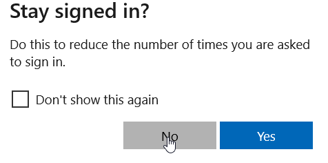
If you are using your own computer or account, you may wish to stay signed in to avoid having to log in every time

If you are on a SHARED computer, you should probably click No (although you shouldn’t really be sharing a computer these days if you can avoid it…)

When you first log in, you will see a section called My Files. These are files that only you can see unless you know how to share them

To see information from teachers and give teachers your work, click Shared on the left hand side

Here you will see a number of files and folders that have been shared with you (these are being updated, changed, and added to regularly, so check here every day!)

Some folders are just information for you to pick up, like this French Resources folder. You go there to get information that will help you do your work

You will see some folders with a subject name and your name on them. These are your personal folders where you may go to hand in or do work. Anything in that folder can be seen by your teacher.

You may also see a number of class notebooks. Explore these to find information and assignments from many teachers. Work completed in that notebook will be visible by your teacher (no need to hand it in)

Sign Modification Project

In order to do a good job of this project, you will need to review the Photoshop Selection Tools post. Those tools will be essential if you are going to do a good job of this, because every sign is a little different, so these instructions will not tell you how to do this step-by-step!

For this assignment, you will take a photograph of a sign and modify it to remove elements and add in new elements that look realistic. PLEASE USE ONE OF THE PHOTOS I HAVE PROVIDED. If you want to use something else, you MUST DISCUSS IT WITH ME FIRST.

Click this link to choose one of these signs, please

It is possible that you MIGHT find something useful on Unsplash. If you want to look there, you can, but you NEED TO SHOW ME YOUR SIGN FIRST. I will tell you whether it’ll work or not. https://unsplash.com/s/photos/sign

Your job is to match new text and elements to whatever is on the original sign.

Some tips:

You can use Photoshop one of two ways:

QUICKLY or WELL

Guess which one I want… If you’re doing this quickly and get it done in a few minutes, it’s going to look terrible and I’m going to ask you to do it again. This project should take some serious time and effort. You’re going to mess things up and redo or fix them. It’s part of doing a good job.

You do not need to create a new file. Just open the sign image in Photoshop and…

ALWAYS make a copy of the original sign before you start. You should have a layer at the bottom or turned off with the untouched image of the sign!

If it’s obvious that you changed your sign, you did not do a good job. If it’s easy to tell what you changed, you did not do a good job. If you did not do a good job, you will have to go back and try again.

Start by CAREFULLY removing elements to replace. Please DO NOT REPLACE EVERYTHING! Your job is to match new elements with what is already there, so don’t get rid of everything!

When it comes time to add new text, make sure that it is a font that looks the same and is EXACTLY the same colour, and the same size as what was on the sign originally

As always, when your project is complete you need to hand it in to your OneDrive shared folder AND post the project on your Edublogs site!

Examples:

Previous student examples:


Photoshop Selection Tools

In order to use Photoshop really well, you need to have a good understanding of the various selection tools. These are the ones that allow us to choose an area of a photo to remove, change, or enhance. If you’ve done the Creature project, you’ve had some experience with the Magic Wand and Quick Selection tools. We’ll review those for people who haven’t done that project, and add some explanation and some new tools.

We’ll practice a few tools with a picture that you should have already. You may have been sent a picture of me for the Creature project, so check your Documents folder. If you don’t have it already, you can find it in the same place as the GWMS logos. You can get those HERE.

Or, you can always get the link from my Links page

Then click on GWMS logos

Once you’re in the folder, look for Project Pics

Then go into the Creature folder

Find the photo of this hideous creature. IMG_1705.JPG works the best:

Click Download, then Direct download

If you’re using Firefox (good choice!), you’ll have to choose to Save  the file

You can probably put this in Downloads

To open it in Photoshop, there are a couple of ways.

First, you could RIGHT CLICK on the photo and choose Open with, and then select Photoshop Elements:

You could also open Photoshop’s Photo Editor, then click the File menu, then Open.

Once you get the program open, you want to switch from Quick to Expert mode

Make sure your Layers panel is open (look at the bottom right of the window)

At this point, you’ve got only one layer (Background)

3 ways to do the next step:

Easy way: Ctrl + J

or

go into the Layer menu and choose Duplicate Layer…

OR…

Go into the Layer menu and hover over New, then click Layer via Copy

Now you’ll have two layers,  the Background and Layer 1

You’ll notice that the Background layer is locked, so you can’t do anything with it at all. Click the lock and it will unlock

Rename your layers. Background should become original

and Layer 1 should become copy

We’ll just leave that original alone in case we mess something up, so turn the visibility off by clicking the eyeball

Make sure that top layer (copy) is selected (it’ll be blue) so that we’re working with it.

We’re going to use the Quick Selection tool

Unlike the other assignment, this time we’ll draw on ME, NOT the wall around me to select it.

If you mess it up at all, press Ctrl + D to deselect and then try again.

Once you’ve got something selected, you are able to use the Move Tool to move that object somewhere else. Turn on the Move Tool (v)


Click on me anywhere inside the selection

And just slide it over to move!

You’ll notice that there’s now a hole in the original picture when you move the selection, though.

UNDO that move and put me back where I belong. (Ctrl + z)

Hopefully you still have me selected. Look for those Dancing Ants going around me.

We’ll look at a few fun ways of getting my ugly mug out of there.

The first thing that you could do is to fill that selection with a colour.

Go into the Edit menu and choose Fill Selection…

Fill it with the Foreground Color

The Foreground Color is the one that’s in the top box you see near the bottom left of your window:

Right now I have black on top, so if I fill it with that, I get something like this:

Undo that and we’ll try something else

This time, let’s fill the selection with the same colour as the wall.

Switch to the Color Picker Tool (I)

And click on the wall

You’ll notice that the foreground colour changes to be the colour of whatever pixel you clicked on

So we can try to remove me by filling the selection with that colour

Go into the Edit menu and choose Fill Selection…

Fill it with the Foreground Color

Now you’ve got this:

As much as it looks like one colour, the wall is actually a bunch of shades of grey, so this doesn’t look very natural at all.

Again, let’s Undo that Fill

This time, we’ll go to the Edit menu and choose Fill Selection…

And now choose Content-Aware. This is a cool tool that looks around your selection and tries to figure out what to fill it with.

This time, you get a much more natural looking fill

However, when you turn the selection off (Ctrl + D), you can still see the outline of me:

Let’s Undo again

This time, let’s select just a tiny bit more to get rid of that outline.

Go into the Select menu and choose Modify, then Expand

You don’t really have to expand it by much. 10 pixels should do:

Now try to fill the selection again

Make sure it’s Content-Aware

And that looks a lot better.

Undo (Ctrl + Z), Deselect (Ctrl + D) and let’s try something else.

Let’s spend some time with the Magic Wand Tool.

There are 4 options with this tool (and most selection tools), New, Add, Subtract, and that other one that I never ever use and can never remember the name of…

If you take the wand and click on the wall, it looks for areas of a similar colour. Again, the wall is not one shade of grey, so it doesn’t select everything. In this case, it doesn’t even select enough of the wall.

Deselect (Ctrl + Z)

The Tolerance setting kind of helps us to adjust how many shades of the colour the tool will select at once. Try moving the slider up just over 100.

Click on the wall again and you’ll see that it actually selects too much now. It’s grabbing my face as well.

Deselect (Ctrl + D)

and bump the Tolerance down a bit:

This time when we click on the wall, it selects just the wall and nothing else, which is perfect.

Deselect (Ctrl + D)

This time we’ll switch tools and select the Rectangular Marquee Tool

Click on the wall and drag out a box roughly the size of my big fat head

Make a new Layer Via Copy (Ctrl + J)

You’ll see that you now have a new layer with just a box of wall on it

Switch to the Move Tool

Grab this selection and move it. It’s like patching a hole in the wall with another section of wall.

Kind of cool, but not entirely useful because it’s the wrong shape.

Switch back to the Quick Selection Tool and just select my massive head:

Switch back to the Rectangular Selection Tool:

Click inside of the selection and move the Dancing Ants to a spot on the wall:

Again we’re going to make a New Layer Via Copy (Ctrl + J)

Again we’ve got a new layer

Again click on the selection and move it

This time try to put the patch over my head.

A great improvement!

Deselect (Ctrl + D) and you’ll see that it looks pretty good

Undo (Ctrl + Z)

Deselect (Ctrl + D)

This time we’ll switch to the Clone Stamp Tool

You might have to play with your brush size a bit here. I chose 100

What the Clone Stamp does is it copies an area from one location and paints it into a new one.

To use the tool, you have to set where you want to copy from. Put your cursor over my cheek

Press Alt and click to set the copy point.

Then go click and paint over another area (like my eye.) You’ll see that it’s copying whatever the little crosshairs (+) touches into the circle. In this case, I let the crosshairs go over my nose a bit, so it started drawing me a new nose.

Have some fun with that tool for sure. It takes some practice to get the hang of it because you have to paint with little strokes (just do a bit at a time) and you have to go and set your copy point over and over again (go to a new area and press Alt then click)

Undo (Ctrl + Z) as many times as you need to restore my face (or just leave it)

Ctrl + D to deselect

One more tool that’s pretty fun is the Content-Aware Move Tool

Make sure you’re on New or Add to selection

Draw a circle completely around me and then click and move it over

You’ll see that I’m magically moved over and the previous spot is patched at the same time! Cool, huh?

Play around and make sure that you have the hang of those tools. You’ll need a good grasp of them for the next assignment, which I’m not going to show you how to do…


Photoshop Creature

Open Photoshop Elements. You can find a shortcut on your desktop or find the program in the Windows menu at the bottom left of your screen.

Again, we will be using the Photo Editor mode and creating a new file.

Your file should be called “Creature” and should be 8 inches by 10 inches OR 10 inches by 8 inches. Your resolution should be 300 pixels/Inch. I like a transparent background for this one.

As always, we should save the project right away. Go into the File menu and Save As… (NOTE: You only need to Save As… the FIRST time. After that, you just Save (Ctrl + S)

If you see this annoying box, save yourself some annoyance and click “Don’t show again”

As always, save your work in your Documents folder. The program will want to save it in Downloads, but you should CHANGE THAT to DOCUMENTS:

Again, make sure that your file name is right and that the type remains Photoshop (.psd)

Once again, switch out of Quick mode into Expert:

I always like to have my Layers panel open, especially for this project:

The first job is to place the photo of the person you are working with:

Kind, generous Mr. Robson has likely given you a photo in your Documents folder or maybe on your desktop. If you do not have a photo, you should ask kind, generous Mr. Robson to either take one of you or send you one of him. You can also find a couple in the same DropBox folder as the GWMS logos, or by clicking here.

The photo will pop onto the background and look something like this:

This time, you do NOT need to fill the entire background (yet), so just hit Enter on your keyboard or click the green checkmark:

We will be starting with the Quick Selection Tool:

This tool is pretty easy and pretty self explanatory. All you need to do is click and drag on the wall behind me/you. Do NOT draw on top of the person or you will have to start again. Just the wall!

You should see a flashing line appear around whatever you’ve selected. It’s often called the “dancing ants.”

If you didn’t get all of the wall the first time, look at the bottom of the screen and make sure that you are on “Add to selection” and you can go draw over the rest of the wall:

When you’re done, you should see something a lot like this.

Once you’ve selected all of the wall, what we actually want is the opposite of this. Photoshop makes it easy to switch your selection around. Go into the Select menu and click Inverse (Shift + Ctrl + I)

Now what we’ve got is just the person selected, no background. We want to take the person and put it on a separate layer without the background. To do this, we need to go into the Layer menu and choose New then Layer via Copy (Ctrl + J)

If you look in your layers panel, you should now have a separate layer.

In Photoshop, you often end up with a lot of layers, and sometimes it can get really confusing figuring out which layer is which. For this reason, I want you to get in the habit of renaming your layers as you add them. To change a layer’s name, all you have to do is double click on  it in the Layers panel and then type in a new name.

Name your bottom layer “Original” and the new one “cutout”

You can turn off a layer so that you can’t see it by clicking the eyeball icon next to the layer. Do this with your “original” layer so you can see your cutout.

The next fun thing to do is to change your character’s skin colour.  For this one, we’ll make sure the Quick Selection Tool is activated

But we aren’t actually going to use that one. Down at the bottom of your screen you’ll see a new panel with a bunch of tool options. You want to switch to the Magic Wand Tool

The Magic Wand Tool selects an area of a similar colour. You can control how many shades of that colour you select at once by adjustin the “Tolerance” slider. For my skin, we’ve found that a number around 67-70 works well.

Now all you have to do is click on my face to select just my skin.

If your number is too high, you’ll select too much. If it’s too low, you won’t select enough. No matter what you choose, you’ll likely have to fix up a few areas, like for example my many chins.

Here it might help to zoom in a bit to get a closer look. Use the Zoom Tool (looks like a magnifying glass)

It can either zoom in or out, so make sure to select the right function.

With the Zoom Tool activated, just click on the area that you want to zoom in to.

There are a few selection tools that could help us here but we’ll stick with the Magic Wand Tool for now. It would be wise to turn down your tolerance for now though.

These selection tools can do 4 things. Start a new selection, add an area to an existing selection, subtract an area that you don’t really want selected, or merge selections.

You could also try the Quick Selection Tool

You may have to play with the size of your brush though

Dending on whether you want to ADD parts in that the initial selection missed or SUBTRACT things that shouldn’t be selected, you may need to adjust the buttons at the bottom.

I like to make sure that the eyes are not included (leave those alone)


I also like to remove my mouth from the selection and leave that alone.

Once you’ve perfected your selection, you may wish to zoom out. You can use the Zoom tool OR use the shortcut Ctrl + 0 (I use that one a lot)

Now it’s time to give your creature a new skin tone. Go into the Enhance menu, choose Adjust Color, and then Adjust Hue/Saturation (Ctrl + U)

Make sure that the new box that pops up isn’t blocking your creature’s face. Grab the top of the box and move it over so you can see the face.

Now basically you just play with those sliders and have some fun.

Hue changes the shade. Move it one way and the face should turn red/purple, the other way it turns green

The Saturation slider makes the face more or less colourful (it adds in or removes colour)

The Lightness slider does exactly what you’d expect. It makes it brighter or darker.

Please do NOT go crazy with any of the sliders. If you adjust any of them too much, you will lose detail and won’t be able to recognize the person any more.

The ones below look TERRIBLE:

Once you’ve got your sliders adjusted the way you like, click OK

Now we’re going to turn off that selection (those Dancing Ants.) To do that, we need to go into the Select menu and choose Deselect OR Ctrl + D

Now for the most fun part! Go into the Filter menu, choose Distort, then Liquify.

There are 3 tools that I really like, but feel free to play around with all of them and see what they do. The first (top) one is called Warp.

For all of them, you may have to experiment with different brush sizes. Warp looks better with a bigger brush, but don’t make it too big!

Once you have a decent brush size, click on an area that you want to stretch and pull on it!

It’s that simple. That’s a lot of fun, but again, don’t get carried away. We always want to at least recognize the person.

Another fun one is Pucker, which closes an area in

Again, experiment with your brush size

Click on an area and hold down your mouse to close that area in. THis works great on open eyes or mouths.

Bloat is the opposite. It works the same way, but expands an area. Again, great for eyes and mouths.

You can also twirl an area clockwise or counter clockwise. It just takes something and twists it either way.

If you get carried away, you can press Revert (try again) or Cancel (no thanks.) If you like your work, though, press OK!

Make sure you’re zoomed out (Ctrl + 0) and you have nothing selected (Ctrl + D)

Click on your original (background) layer

We’re going to put your creature into a new habitat. Figure out what type of environment might be suitable for this character.

I highly recommend a photo site called Unsplash (https://unsplash.com/)  There, you can download Creative Commons images that you can legally use in your projects. This one is great because you don’t always have to even give them credit for the photos, which works really well for projects like this.

If you wish to use another photo site, please use a Creative Commons site. You can find many on my website on the Links page, under Copyright Free Content.

If you go to Unsplash, all you have to do is search for whatever background you want. Keep it general. Things like “mountains,” “trees,” or something like that will give you good results, but something very specific (George Waters Middle School) will likely not show up.

Type in your search and look for a good image. If you find one, you just have to click the little downward arrow at the bottom of the photo to get it:

When you use someone else’s content, you’re usually supposed to give them credit. Most Creative Commons sites make this easy. Normally you’d follow the directions below, but we don’t really have anywhere to put the credit, so we’ll skip that step.

Make sure you Save your photo. It’ll likely go in your Downloads folder.

Now you just Place the image into your file in Photoshop.

Use the Move Tool to stretch it out and fill up the background

Rename your picure layer to represent what is on it:

You should also use the Move Tool to move your cutout layer into the best position on top of the new background.

If you want to, you could add some neat effects to your character as well.

On the bottom of your Photoshop window, look for Styles and click it.

This gives you a variety of effects that you can add. It opens on Bevels (which are neat rounded edges) but there are many others hiding underneath. My favorite for this part is Outer Glows:

This is a bit of a common (overused) one:

Try some others:

If you like the style but don’t like the colour, you can adjust it:


The last real thing that we have to do is figure out what this creature will be called. You’ll have to come up with a clever name for your new creation.

Switch to the HOrizontal Type Tool (looks like a T)

As with anything else, I always want you to make your own choices about how your text should look, so make sure you take your time and choose a font that looks good to you. Never just go with the font that the program recommends.

Choose a colour that makes sense with your background and creature.

I chose one that was close to the colour of my creature:

It doesn’t stand out very well yet and is somewhat hard to read.

Again, switch to Styles down at the bottom

And look at your various options for making your text look better. Feel free to play around with any of the options and see how they look. You can always Undo (Ctrl + Z) if you don’t like an effect.

The two I like most for Text are Stroke and Drop Shadow. Stroke creates an outline around your text, making it much easier to read:

See, much easier to read!

But maybe you don’t want it black or want to adjust the size, or something else. Click on the little wheel at the top right of that panel (right below Share)

Here you can adjust the colour, size, position, or kind of fade out the effect

Drop shadows also make your text stand out. It kind of raises the text off of the page and gives it a bit of a 3D effect:

And that’s pretty much it! Just check that everything looks good.

Open your Layers panel

And make sure that your layers are named properly. Make sure that there are no extra, unnecessary layers. If you want to get rid of a layer, just highlight it and press Backspace or Delete or press the little trash can above the layers.

Before you close and drop off, you may want to take a picture of your project to post on your website. Make sure you can see the whole thing (press Ctrl + 0 if not).

To activate your “camera”, press Fn + F11 (or, if that doesn’t work, just F11 works for some people.) Click and drag a box around your project and save that on your computer by pressing the top option.

When closing/saving your work, make sure that you save it in your Documents folder!

Go to your Edublogs site, log in

Create a New Post

or

Call it Creature

Post your picture if you like:

If you like, change your display settings to have your works go next to your photo:

The important part is that you need to answer 3 questions IN DETAIL:

1) Describe the project. Tell me about what you were supposed to create, what was supposed to be included, and what new things you might have had to learn/do.

2) What do you like about your work? What are you most proud of? Come on, celebrate your achievements! If you aren’t proud of your work, FIX IT so that you are! Explain why you like your work or what stands out as looking most interesting/impressive.

3) No matter how great your work is, there’s something that COULD be better. If you had all of the time in the world or if you had to do this project again for whatever reason, what would you try to do better? There must be something! If you say “Nothing” that will also describe the mark that you will get for this question!

Once you’ve got all of that done, DROP IT OFF!

OneDrive login

Drop Off instructions

GWMS Pride Poster

You may have seen some of the GWMS pride posters that have popped up around the school. Most of them look something like this:

Now, it’s your turn to make one. If yours is particularly good and you’d like this, we will print it and put it up around the school, and share it on social media.

You will use Photoshop Elements to create your poster. You can find a link to the program right on your desktop:

Once the program opens, along the bottom there are three options, Photo Editor, Organizer, and Video Editor. You want the first one:

Click the little triangle next to Photo Editor and choose New File:

First, create a descriptive file name. Call it GWMS Poster:

Next, we’ll set up the paper size. The first step is to change the measurements from centimetres to inches:

The posters in the hall are either 11 x 17 inches or 17 x 11 inches. You can choose whether you want your poster to be wider (landscape) or taller (portrait) orientation:

Most of them are 17 inches wide, so my example will be as well.

You also need to change the quality of your image to make it printable in high quality.

Change the Resolution measurement to Pixels/Inch, and make the number 300:

Once your document opens, make sure you SAVE it in your Documents folder!

To see the full features available in the program, make sure you choose the “Expert” tab across the top (it first opens on “Quick”)

You will want to open a panel to keep track of the layers in your document. Find this panel under the Window menu at the top of your screen, or just press the F11 key to open Layers.

Go to misterjrobson.com and click on LINKS:

Find the link to download GWMS logos

Find the SchoolPhoto and download

Make sure that you SAVE the file:

(It will probably go into your Downloads folder unless you change the location)

You will also want a GWMS logo. Choose whichever one you like!

Once you have your images, switch back to Photoshop.

Under the File menu, choose Place…

Go find your school photo first and place that on your page.

If you have your Layers panel open, you will start to see things getting piled on top of the white background.

You will notice that the image does not fill the entire page, no matter whether you have chosen a Landscape or Portrait layout

Hold SHIFT on your keyboard and pull out one of the corners to fill either the left or right side. Be careful when you are doing this that you do not STRETCH or SQUISH your photo. Keep the proportions right so that it looks realistic.

Do the other side as well

Now your photo should fill the entire page.

At the bottom right there is an option to commit (keep) the change (check mark) or revert back (try again – Do Not Enter symbol)

Now place a GWMS logo on top of the school photo. You can move and resize however you like.

Once again, click the check mark or hit Enter to accept the changes.

We’re going to add a box in the background of our text. I like that box to be the same colour as the Sharks logo. To make that possible, you need to use the Color Picker Tool to pick up that colour. The tool looks like an eyedropper, so click on it to activate the tool.

Once it’s turned on, go and click on the blue in the GWMS logo.

On the bottom right of your screen you have two boxes with colours in them. These are your foreground and background colours. When you first start up the program, they are black and white. Once you use the color picker, your top box (the foreground colour) should change to that colour.

Now we’ll switch tools to draw our coloured box. Click on the tool that looks like a little blue blob.

There are a bunch of different shapes that you can draw, I’m going to use the Rectangle. You could try another shape if you think it’ll look better for you.

You could also choose to switch to a different colour if you think it’ll look better.

Click and drag out a box to cover whatever spot on your page you think is best for the text.

You’ll see a shape layer appear in your Layers panel.

If necessary, you can use the Move Tool (the top left tool, you can also press the v key to activate it) to move or resize your box.

Following that, you’ll need the Text tool (looks like a T, the t key on your keyboard will activate it)

At the bottom of your screen you’ll see a box that will allow you to change the font (PLEASE DO!), the size, and the colour of your text. You can make it bold, add italics, change the justification (left, center, right), and more.

Click on top of your coloured box and start typing. You do NOT need to insert or draw a text box! Just click and type! Once you type your message, you’ll see that final layer appear in your Layers panel.

You can use the Move Tool to adjust the box and it will adjust the size of your text at the same time.

Something else that you can do is adjust the Opacity of a layer so that you can partially see through it. Any time you want to do anything to a specific layer, you need to select that layer in your Layers panel. Click on the Shape layer. At the top of the panel, you’ll see a box called Opacity. Try turning that down a bit and see how you like it. You don’t want it too light, so don’t turn it down too far.

You can do the same with your Sharks logo if you wish.

Feel free to be creative and have some fun with this. Don’t get too crazy and be silly, but if you have better ideas for how to improve the poster, go ahead and add/change things!

Once you like the look of your poster, you can save and drop it off in OneDrive.

Posters that look great and represent our school well may be printed and hung in the halls and/or used on social media!


Tell the World about #myGWMS

We’re looking to show off the great people, programs, opportunities, and just the all-around fun that happens here at George Waters. If you’ve got something that you love about our school or something that we should brag about, here’s your chance! Share your idea and you could end up in a video, on social media, in a poster, or even on a button or t-shirt!

The Hour of Code 2019

This week is Computer Science Education Week, and there’s a huge worldwide activity going on this week called The Hour of Code, where millions of people will learn how fun and easy it can be to learn to write computer code. Whether you’re trying to build or fix your own website, animate your designs, write an app for your phone or tablet, or just see what you can teach computers to do, learning code is really important and fun. You have no idea how much you’re capable of doing right now, until you try.

These skills will help make you part of a growing workforce of people who require computer science skills. These skills are becoming more important in almost every area of society, and sadly, there aren’t nearly enough people with those skills to fill important positions. By increasing your skills, you give yourself a far greater chance of landing a good job in the future, and unlock worlds of new possibilities now.

If you take a moment and create an account, you can save your progress so you won’t have to

Please Join our class: https://studio.code.org/join/TWGDSN

If you prefer to pick your own path, go here: https://code.org/student/middle-high

Many more cool options here (Minecraft, Star Wars, sports, Flappy Bird, etc.) https://hourofcode.com/ca/learn

OR you can try it out at Code Combat (a bit more challenging): https://codecombat.com/students?_cc=LeafLateGold

OR you can try it out at CodeHS (a bit more challenging): https://codehs.com/go/9ADED

Assignment 2: Microsoft Word Trading Card

Next up, you are going to create your own trading card. It can be for yourself, your favourite hockey player, athlete, Pokemon, super hero, Teletubby, technology teacher, or anything, really!

Be CREATIVE and HAVE FUN!

You will use a lot of the skills that you learned in creating your timetable, so I WILL NOT show you this one step-by-step! There are a couple of new things that I will show you, but otherwise, you’re on your own.

Here’s my fabulous example:

Note that at the bottom, there’s a TABLE with some statistics. The left column is aligned on the left, the middle one is in the centre, and the right one is on the right. The borders are invisible.

With the borders, it looks like this:

You will have to use most of the skills you learned in the previous assignment:

  • Save your file in the correct spot as Trading Card.docx
  • I did not change my layout but I did change my margins to narrow
  • The blue & black background is a Shape:

I used a rectangle with rounded corners, but choose whatever works best for you. Consider using more than one shape if you like!

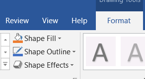
You can change the colour of your shape with “Shape Fill” and the border around it with “Shape Outline”

Then ALL of my writing is in Text Boxes (much easier to move around!)

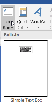
Under Insert, choose Text Box, and Simple Text Box

Draw it wherever you want on your page. I used THREE of them (one for the title, one for the biography, and one for the statistics table.)

Text boxes can/should also have a Fill and an Outline!

Then back to skills that you already know:

  • Change fonts, sizes, and colours
  • Properly centre text (and in your table, put the right column on the right)
  • Add a picture (those can/should have a border too!)
  • Table at the bottom with statistics. Make it at least 3 columns and 2 rows. Your statistics could include things like height, weight, superpower, teams played for, awards won, favourite food, or whatever you want, really. Make a heading row (and make those headings bold, underlined, or a different colour so that they stand out!)